Salesforce Engage Desktop + Mobile App
Redesigning Salesforce Engage's desktop experience across Alerts, Campaigns, and Reports, and expanding it to a mobile app so sales reps could stay connected to their prospects wherever they were working.
The setup
Sales teams move fast. They're on calls, in meetings, on the road, and constantly switching between tools. Salesforce Engage was built to give them a smarter way to work, connecting marketing-approved content, real-time prospect alerts, and email campaigns directly inside Salesforce so sales reps could act on the right information at the right moment.
The product had launched. Customers were using it. But the feedback coming back from the field was clear: the tool had the right ideas but the wrong execution. Data was overwhelming instead of actionable. Key workflows were missing. And sales reps who spent half their time away from their desks had no way to access any of it on the go.
I was brought in as the UX Designer to fix it, working alongside a dedicated UX researcher and a Product Manager to redesign the experience across both desktop and mobile.
What was broken
Three distinct problems had emerged from early customer feedback on the desktop app.
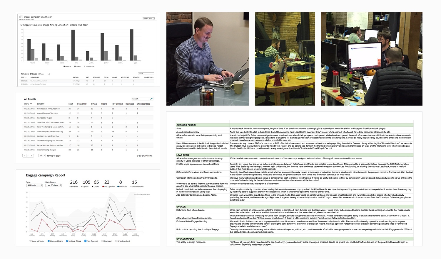
The first was information overload. Engage Alerts surfaced real-time prospect activity, which was the core value of the product. But the volume of data was overwhelming rather than useful. Sales reps couldn't filter what they saw, so everything competed for attention and nothing stood out.
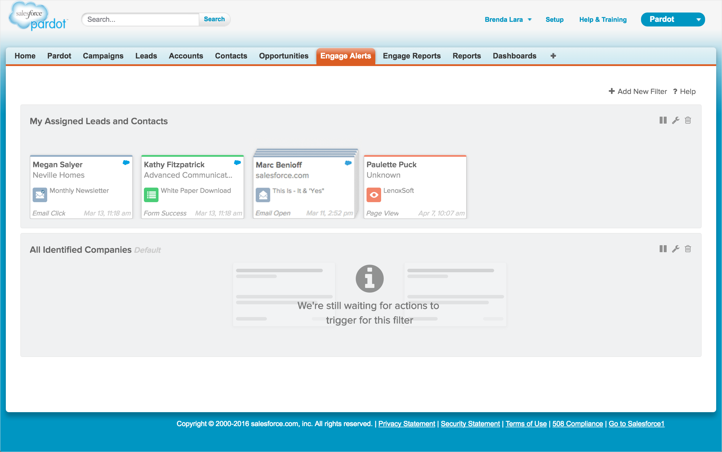
The original Engage Alerts experience before the redesign, showing the information-dense layout that overwhelmed users with unfiltered data.


The original Alerts experience showing the prospect detail view and the new filter functionality added to help sales reps control what data they saw.
The second was a missing workflow. Sales Development Representatives often needed to send emails on behalf of the Account Executives they supported, but the app didn't support it. It was a fundamental gap for how sales teams actually worked.
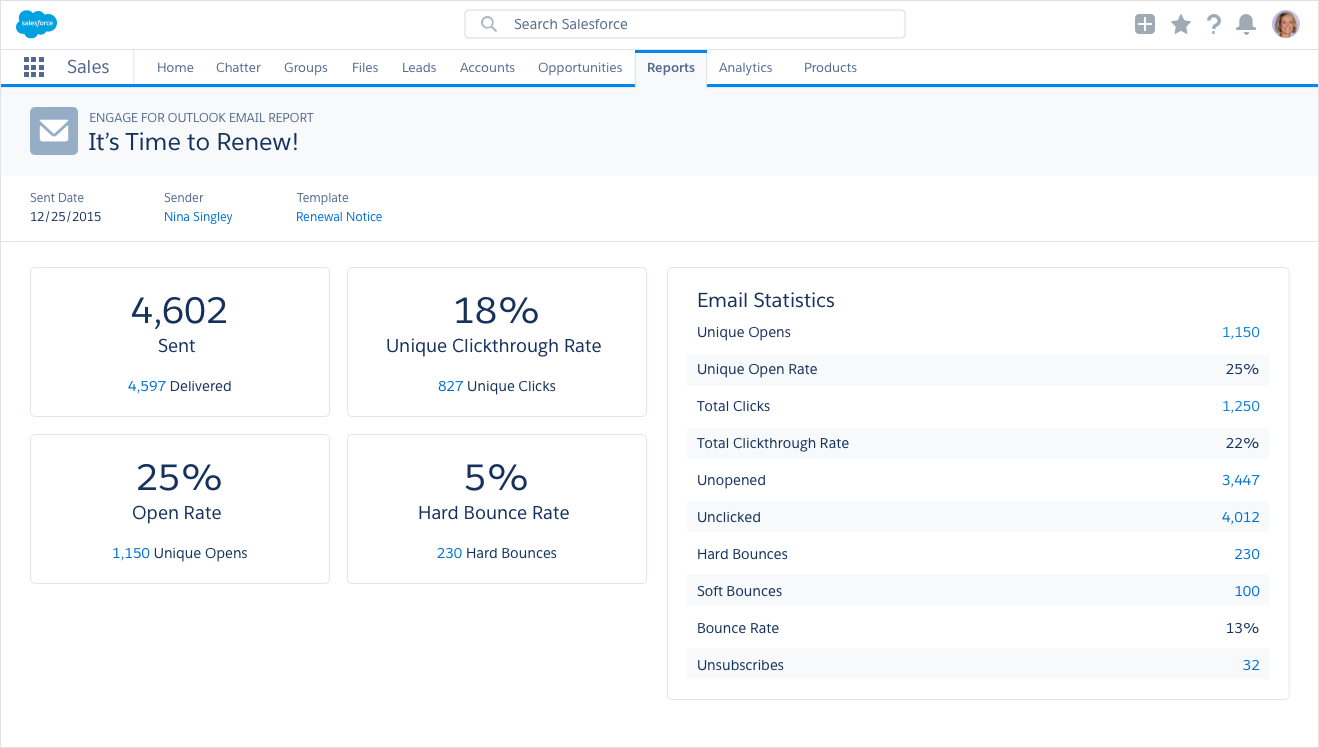
The third was reporting that didn't match reality. Sales cycles can span months. The existing reporting only covered 7, 14, and 30-day windows, which made it nearly useless for understanding long-term performance. Sales managers also had no visibility into team-level adoption and ROI.
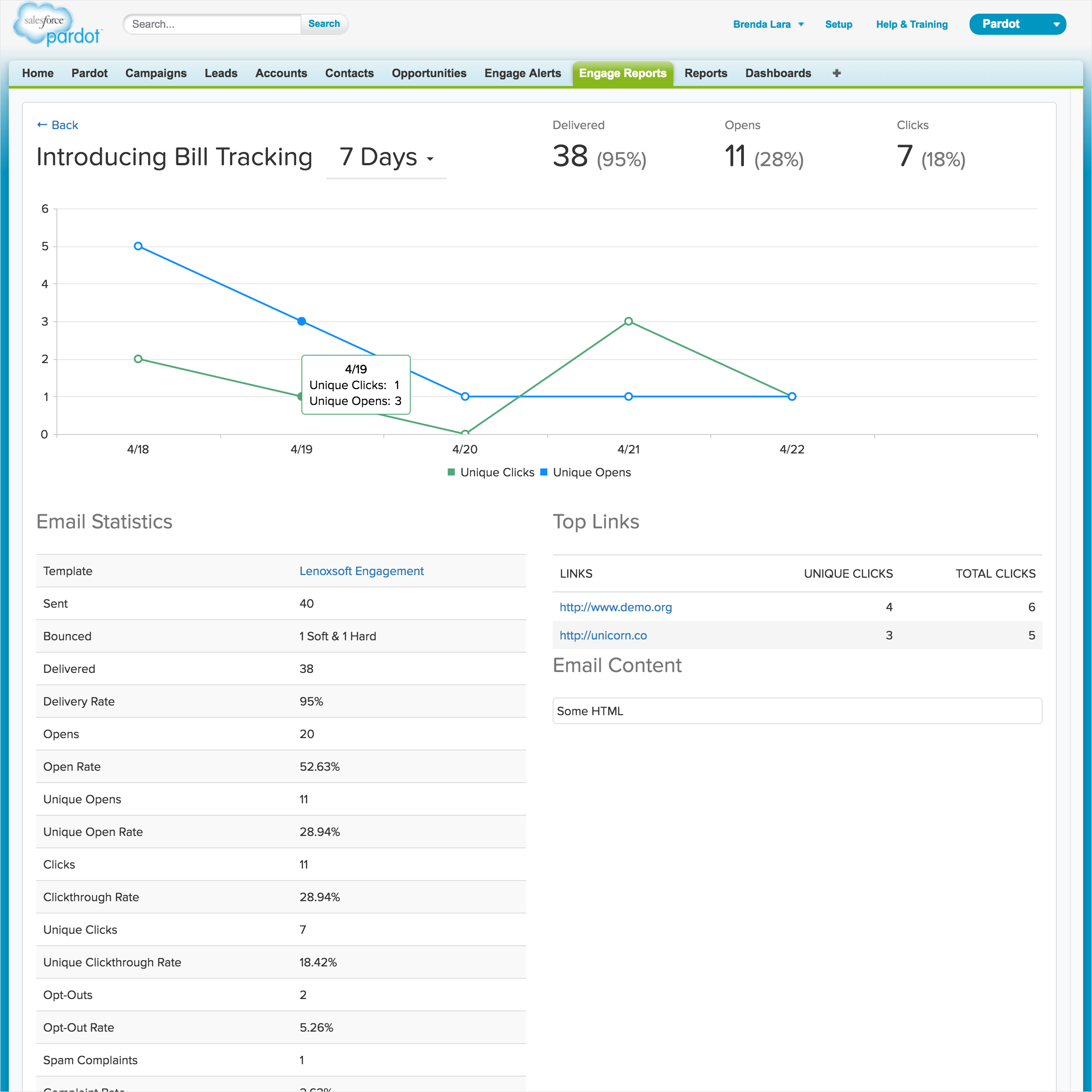
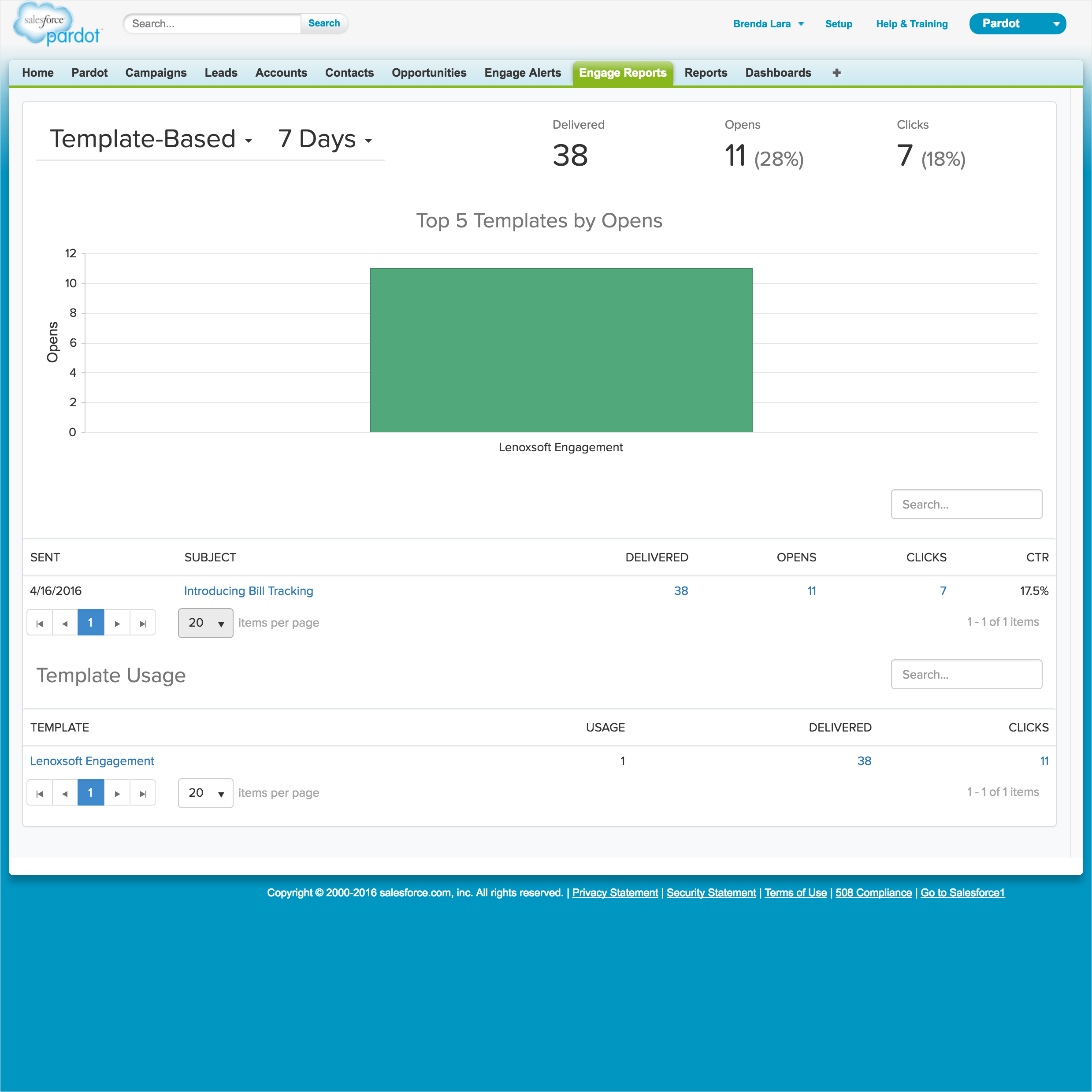
The original Engage Reports experience, limited to 7, 14, and 30-day windows with no team-level visibility for sales managers.
On top of all of this, the entire product was desktop-only. A significant portion of sales reps worked on the road and had no access to Engage alerts, campaigns, or any feature while away from their desks.
Getting closer to the problem
We invested heavily in research before touching a single design. My UX researcher organized onsite visits with three customer companies, where we spent time in their actual offices watching how sales teams worked day to day. Nothing beats seeing users in their environment. We came away with a clear picture of how busy and time-pressured these teams were, and how much "time is money" shaped every decision they made.
Onsite research visits with customer sales teams, combined with visualization research exploring how reps actually used reporting data day to day.
We followed the onsite visits with moderated research sessions, ten participants for the desktop features and twenty for mobile, presenting design concepts and gathering direct feedback on whether our direction was solving the right problems.
The most surprising insight came from reports. We had assumed data visualizations would be well received. Users pushed back hard, with one participant putting it plainly: pie charts were eye candy they had no use for. They wanted tables, because tables contained the data they needed to make decisions quickly.
"Pie charts are just eye candy which I don't find useful, so I don't want them. I am here for the data, so please use tables."
Research participant, on reportingI also led cross-functional sessions using journey mapping and empathy maps to make sure the team had a shared understanding of who we were designing for before we started building.
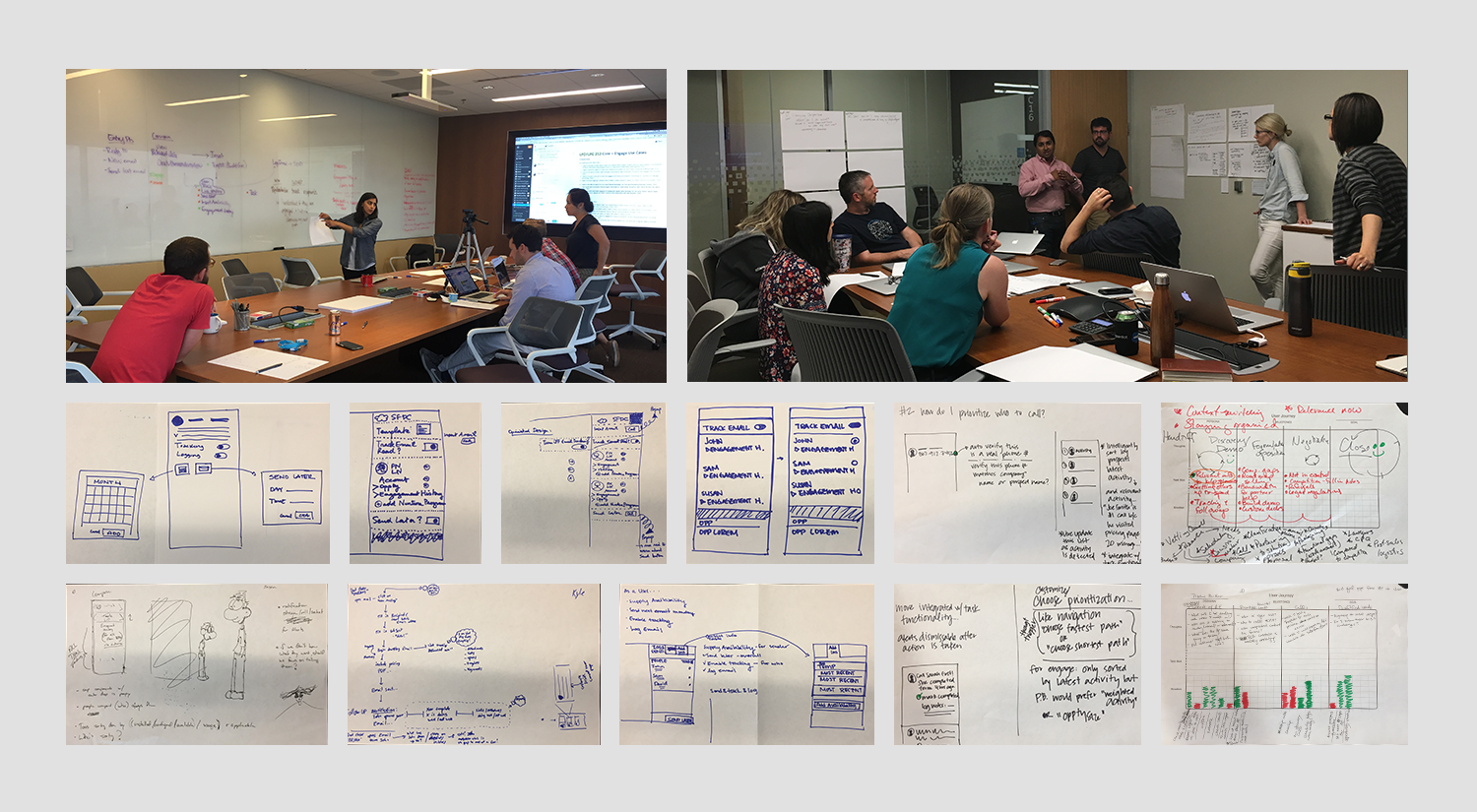
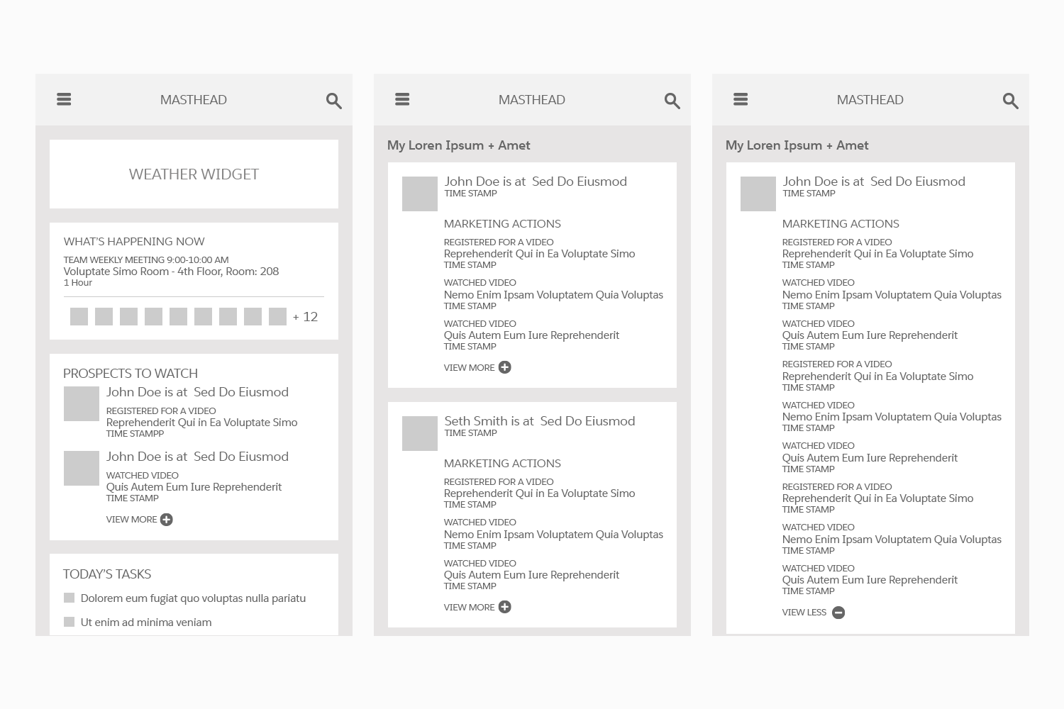
Cross-functional brainstorming sessions and collaborative sketching used to explore design directions before moving to wireframes.
What I built, and why
For the desktop redesign, I worked across three phases.
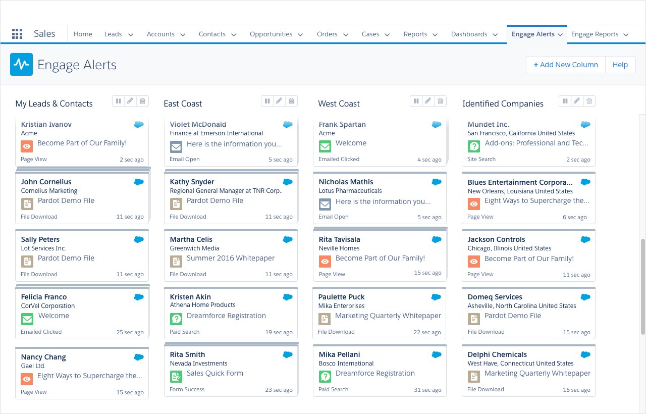
Phase One was Alerts. I redesigned the experience around a cleaner column layout and introduced extensive filtering controls so sales reps could configure their alerts to show only what was relevant to them. The goal was turning a firehose into a focused signal.

The redesigned Engage Alerts experience featuring a clean column layout that gave sales reps a focused, scannable view of their most important prospect activity.
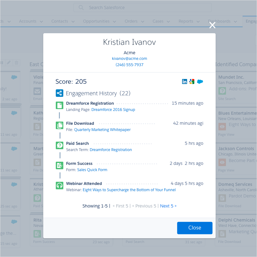
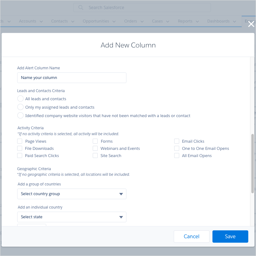
Prospect engagement detail view on the left and the new Add New Column filter functionality on the right, giving sales reps granular control over what data appeared in their alerts.
Phase Two was Campaigns. I built out the ability to create, save, and search marketing-approved email templates, added the ability to send on behalf of other team members, and introduced email preview so reps could see exactly what a recipient would see before sending. Campaigns also became accessible directly from Gmail and Outlook.
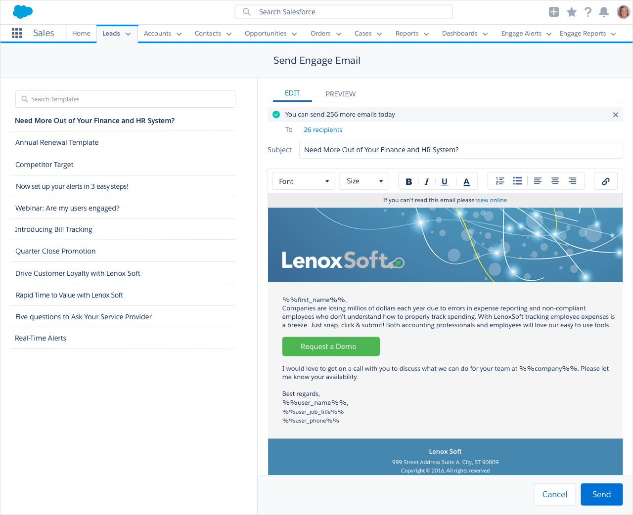
The redesigned Campaigns experience showing the template library on the left and the email composer with preview on the right, giving sales reps access to marketing-approved content they could personalize and send directly from Salesforce.
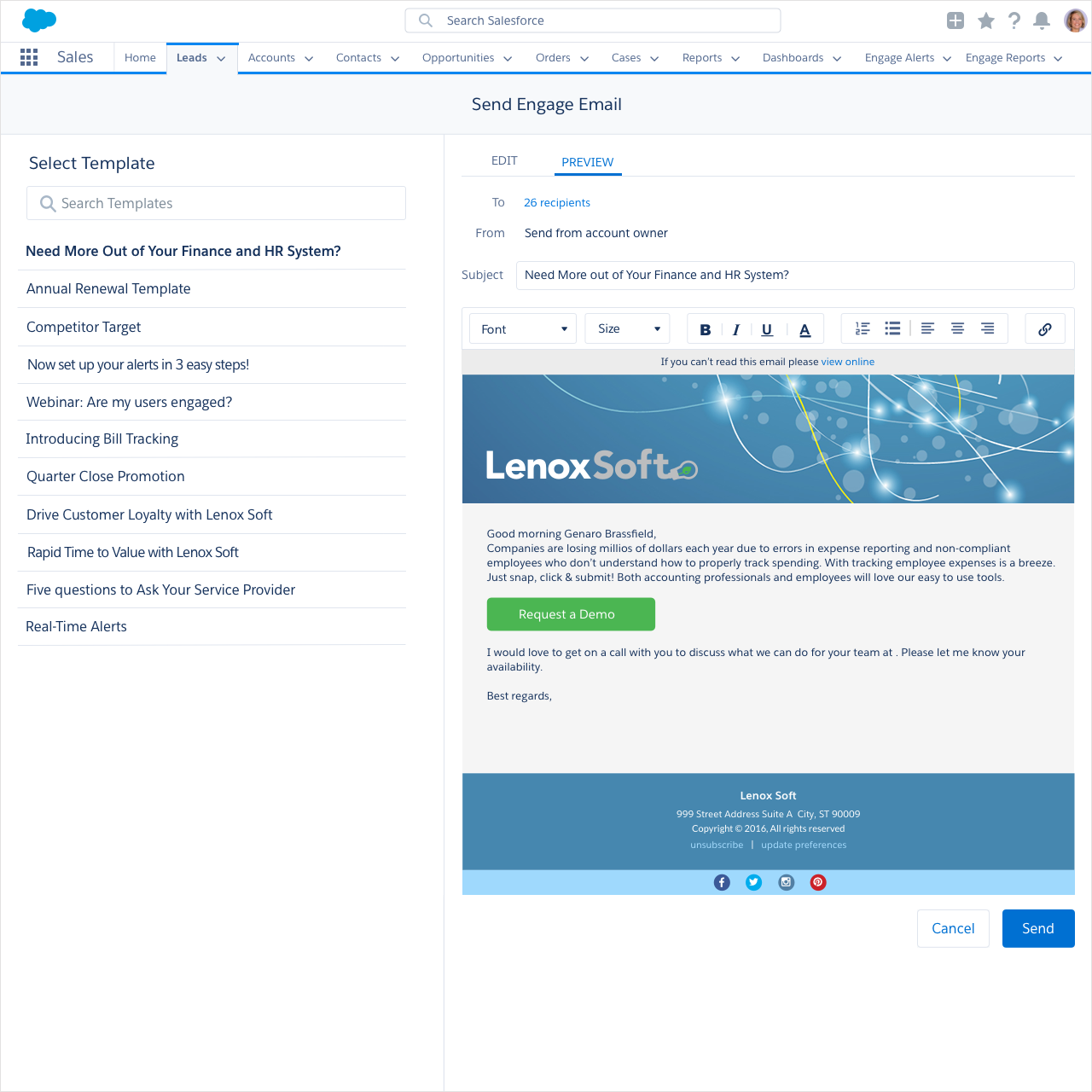
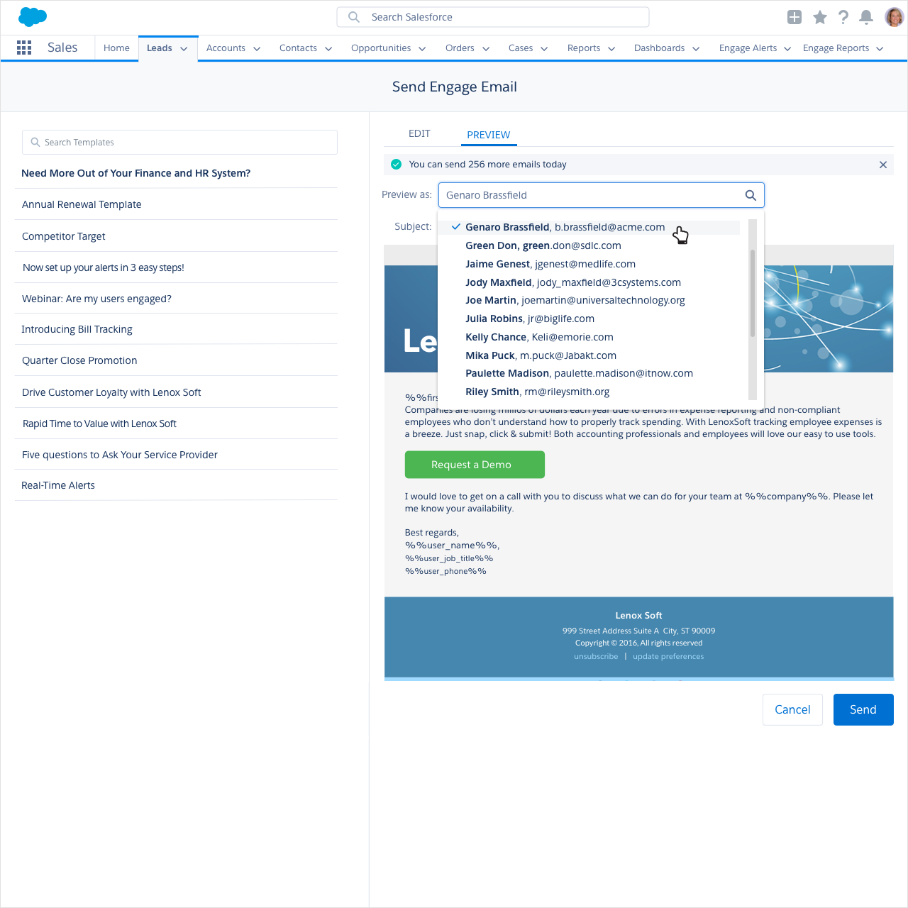
The email preview and send on behalf of features, allowing sales reps to see exactly what a recipient would receive and send emails on behalf of other team members directly from Salesforce.
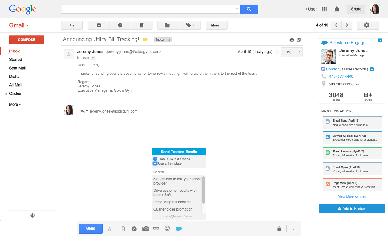
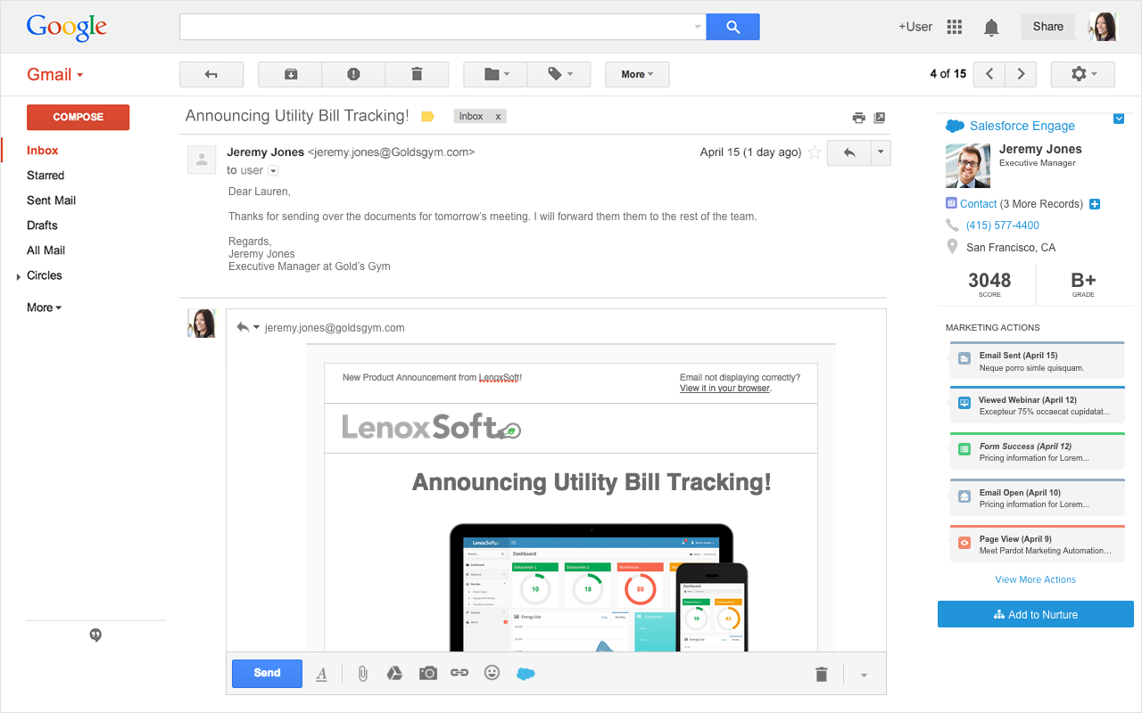
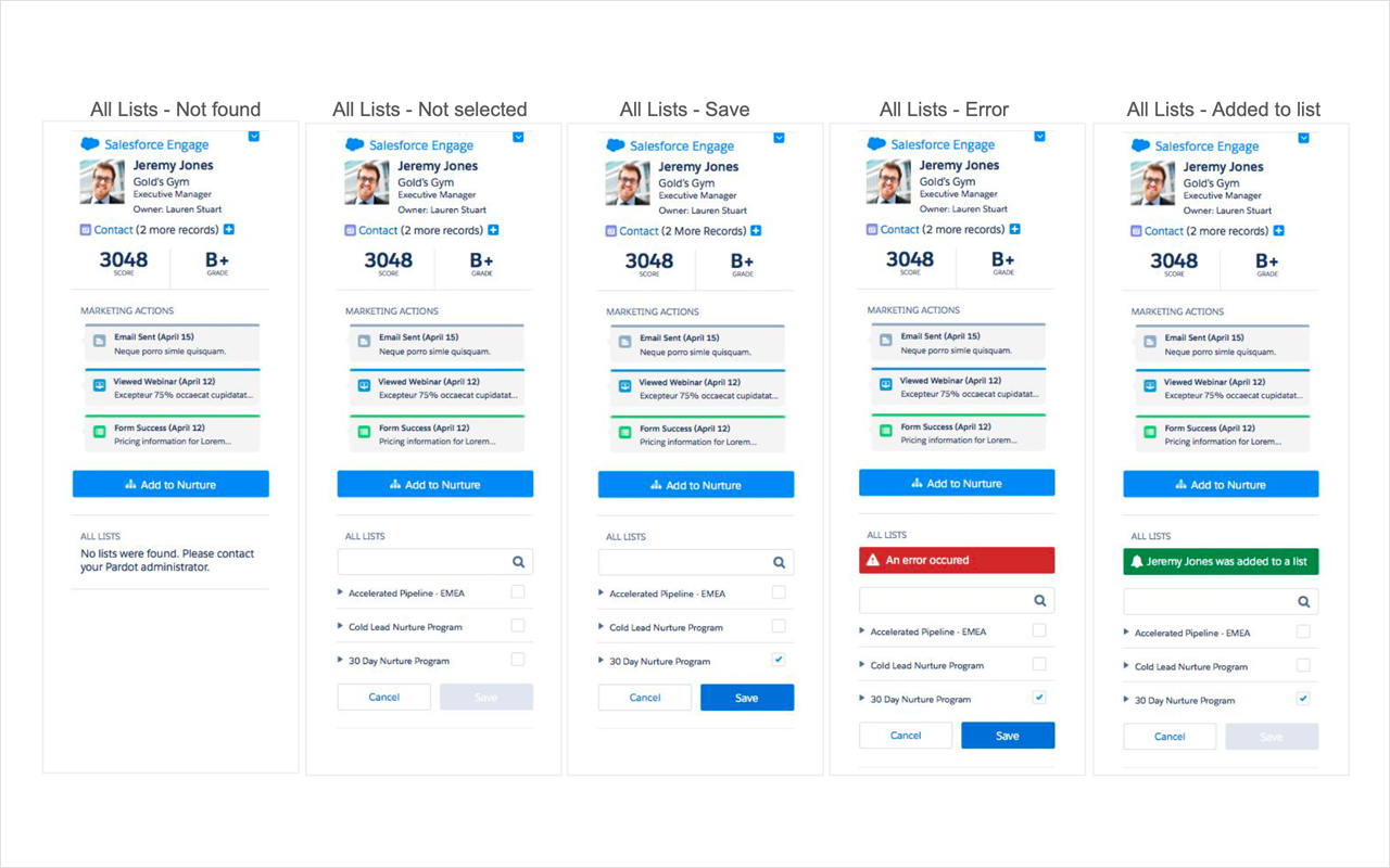
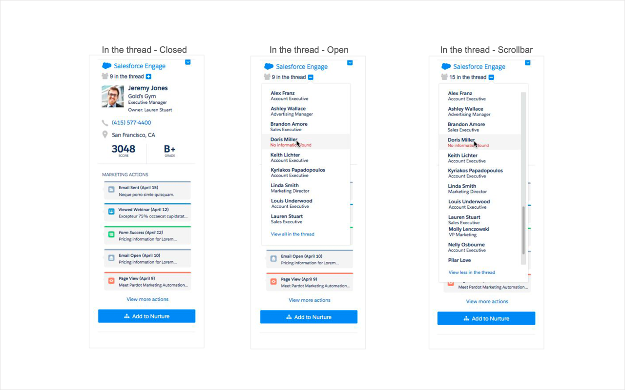
The Gmail integration bringing Salesforce Engage campaigns directly into the inbox, with tracked email sending, prospect activity sidebar, and add to nurture functionality accessible without leaving Gmail.
Phase Three was Reports. Based directly on what users told us in research, I designed a table-first reporting experience that extended time ranges to match real sales cycles. Sales managers got team-level reporting with visibility into adoption, performance by rep, and which templates were driving the best results.
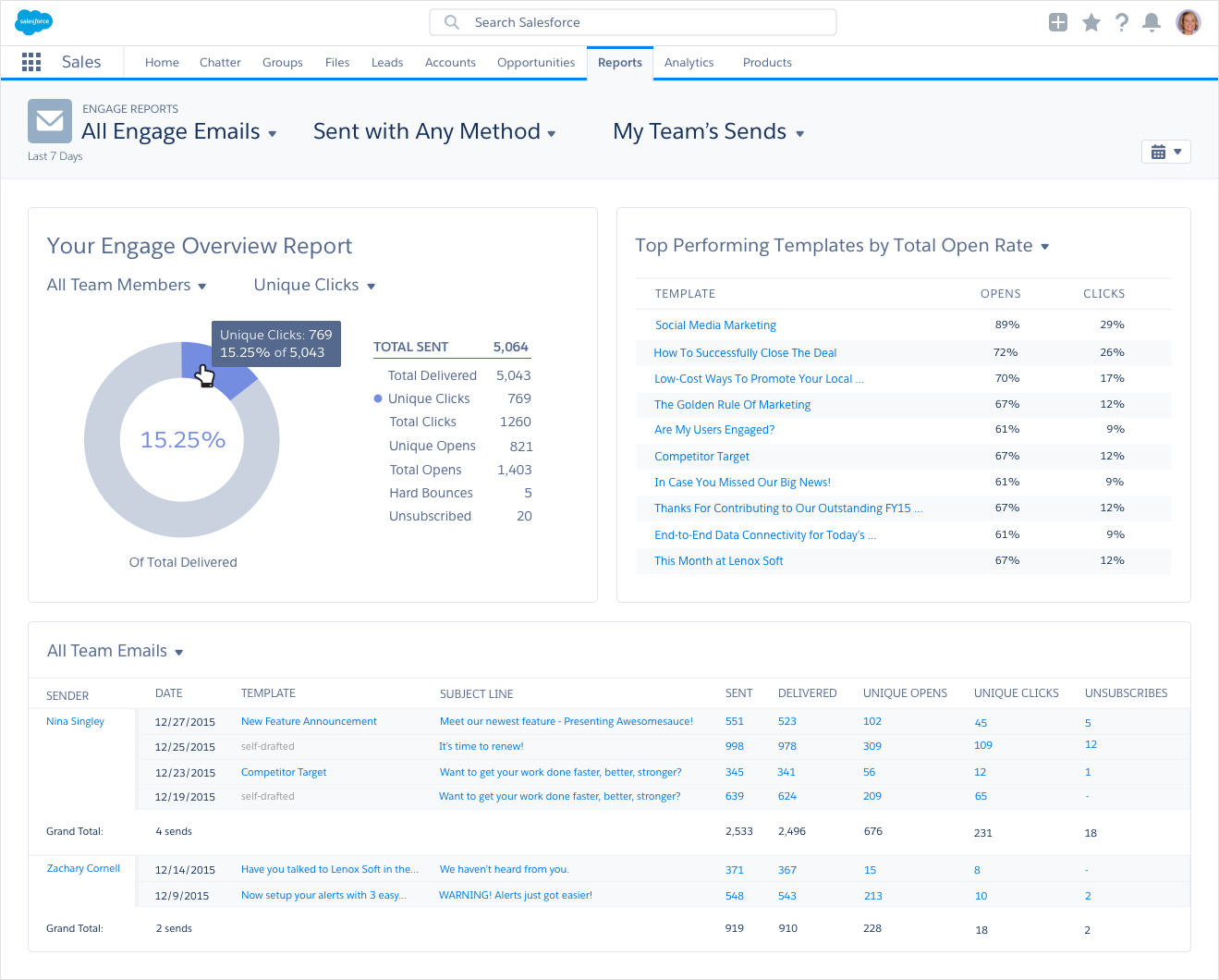
The redesigned Engage Reports experience showing the team overview dashboard with top performing templates, detailed send data by rep, and extended date ranges that matched real sales cycles.
Individual email performance report on the left showing detailed send statistics, and the recipient drill-down view on the right letting sales reps see exactly who opened and engaged with their campaigns.
For mobile, I designed the Salesforce Engage app for Salesforce1, giving sales reps on the road access to real-time Engage Alerts, the ability to add leads to nurture campaigns, and call and email features, all from their phone. I also created tablet views and built mobile prototypes that were used in Dreamforce marketing presentations.
Early mobile wireframes exploring the home dashboard, leads feed, and prospect detail view for the Salesforce1 app.
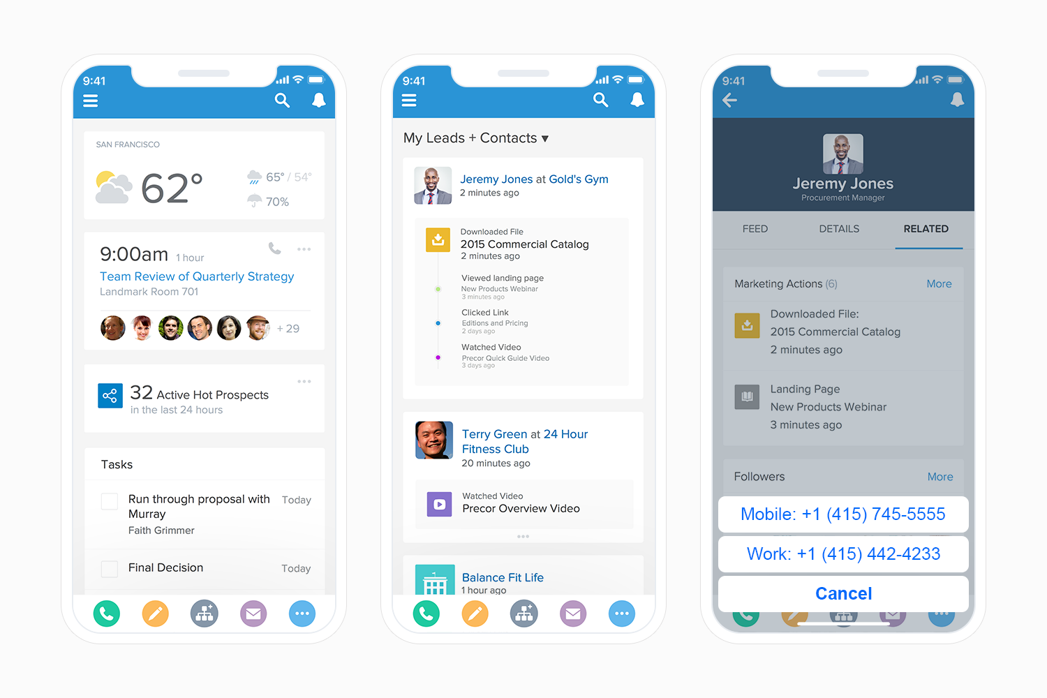
Final mobile designs showing the home dashboard with real-time hot prospects, the leads and contacts feed, and the prospect detail view with marketing actions and one-tap calling.
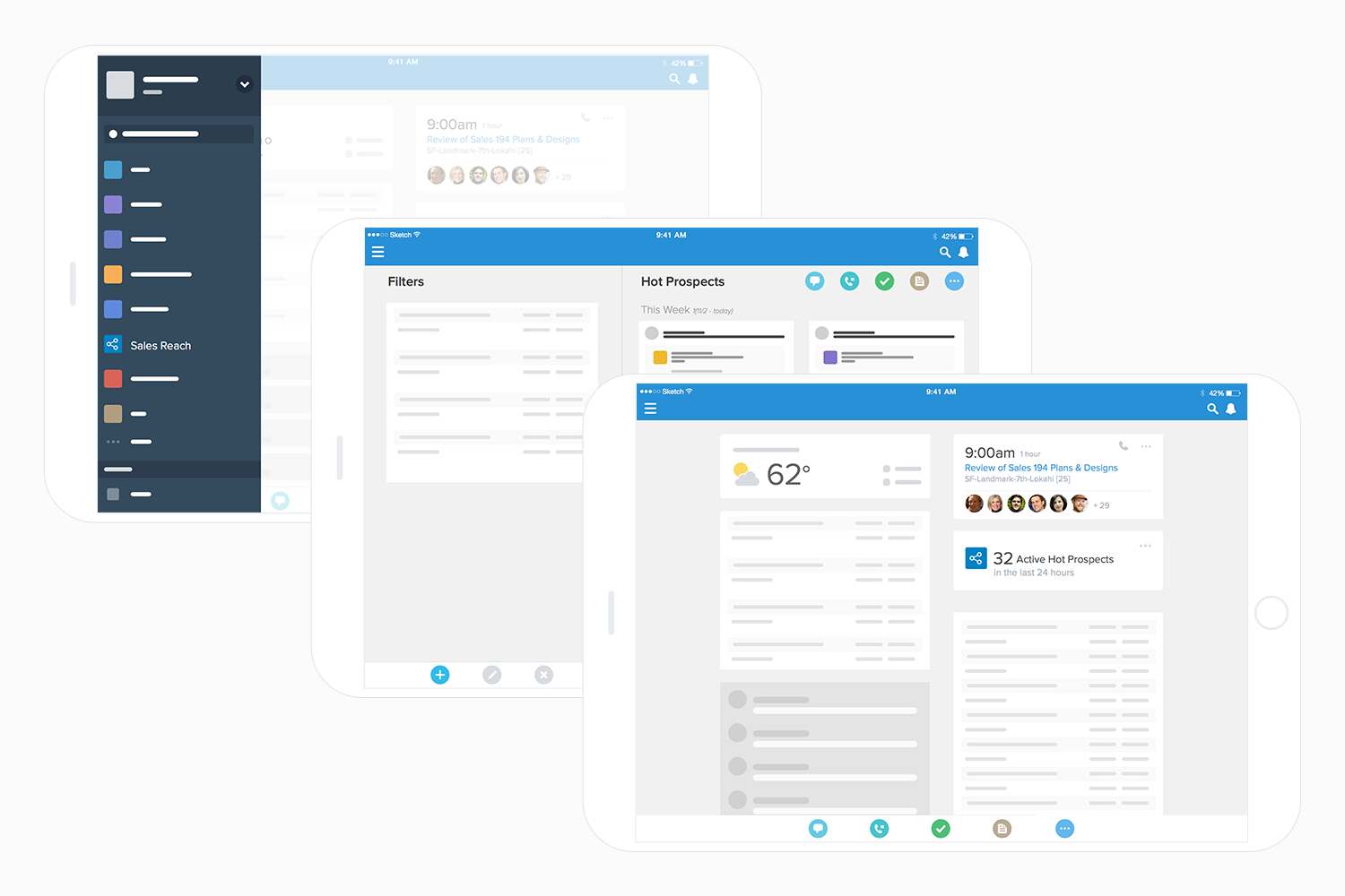
Tablet wireframes exploring navigation, filters, the hot prospects list, and the adapted dashboard layout for larger screens.
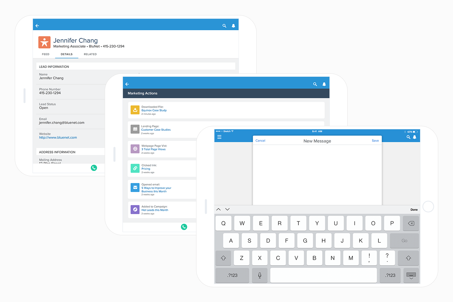
Tablet designs showing lead details, the marketing actions timeline, and the new message compose experience.
While designing the expanded alert detail view, I discovered the Lightning Design System didn't have an activity timeline component. I designed the Activity Timeline from scratch in collaboration with the Salesforce design system team, and it has been adopted broadly across Salesforce products.
What it took to ship it
Four months, three desktop phases, and a full mobile app. I worked closely with a UX researcher, ran cross-functional design sessions with stakeholders, participated in UAT sessions, and analyzed A/B testing results to refine the experience after launch.
The onsite research was the foundation everything else was built on. It gave the team a shared, grounded understanding of what sales reps actually needed that no amount of internal discussion could have produced.
What changed
Salesforce Engage shipped with a redesigned desktop experience across three phases and a net new mobile app that extended the product to sales reps wherever they were working.
Challenges
Three challenges shaped how I worked on this project and how I think about designing for enterprise products today.