Calendly Integrations Pages Redesign
Redesigning Calendly's integrations experience to reduce friction, scale to 41 integrations, and give users the clarity they needed to connect the tools that matter most to their work.
The setup
Calendly's integrations page worked. Nothing was technically broken. But the experience was creating unnecessary friction. Users struggled to understand which integrations were connected, couldn't tell the difference between admin-only and user-configured integrations, and had no clear path forward once they landed on the page.
From a business perspective, integrations are critical to retention. When customers connect Calendly to the tools in their workflow, scheduling data syncs automatically and manual work disappears. A confusing integrations experience wasn't just a usability problem. It was a churn risk.
The challenge: without a visible crisis, it was hard to justify putting this on the roadmap. I needed to make the invisible problem measurable.
A problem no one could measure
I first started noticing the issues by joining regular customer calls with my product manager. Users were confused in consistent, predictable ways. They couldn't tell which integrations were connected, didn't understand what admin-only meant, and had no sense of what to do after landing on the page. The feedback was clear, but qualitative feedback alone wasn't enough to get the project greenlit.
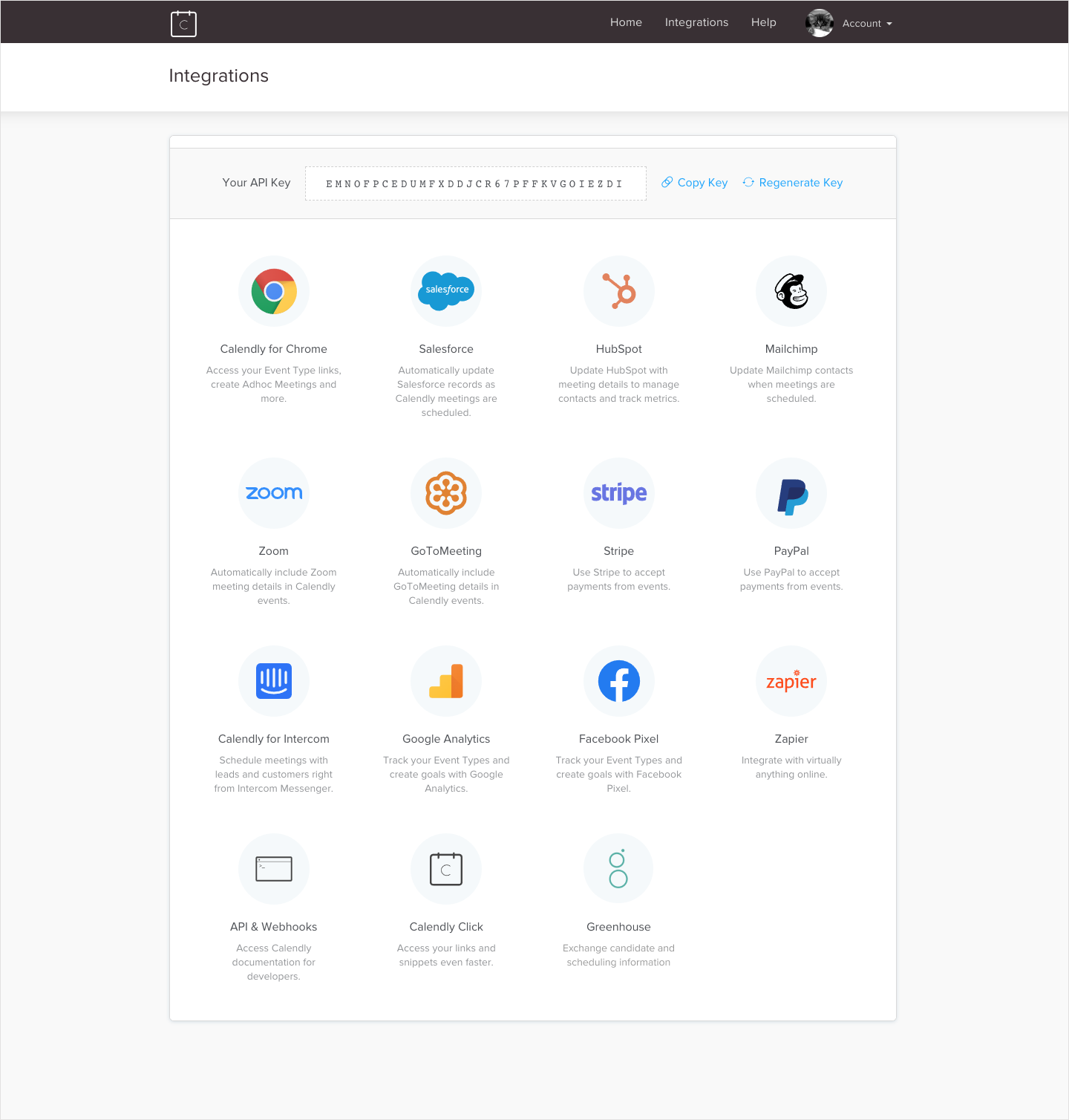
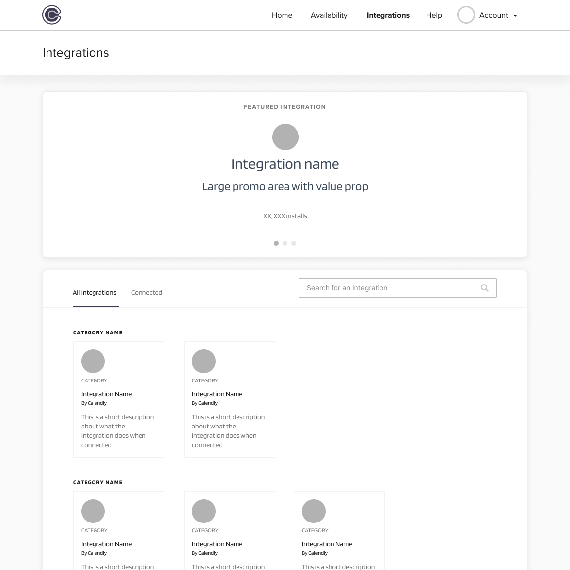
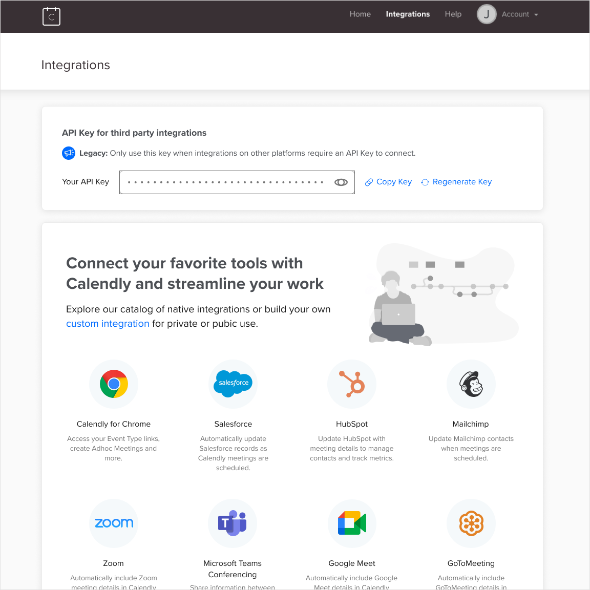
The original integrations homepage: no clear hierarchy, no connected state, no category structure, and an exposed API key that created confusion and security concerns.
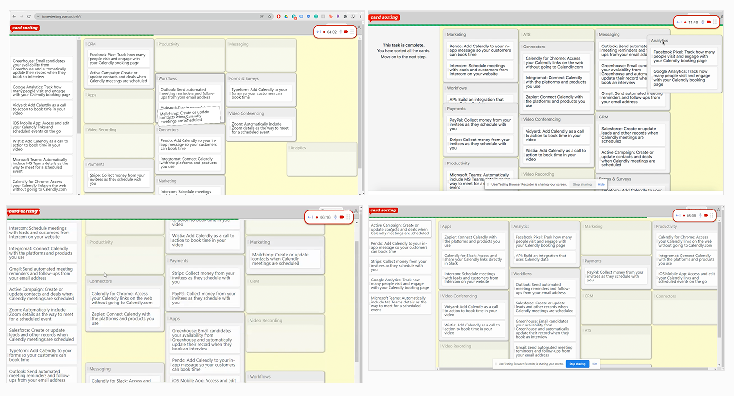
To make the case, I designed and ran a System Usability Test with 30 participants, all Calendly admins who had connected at least one integration in the past 12 months. I also ran 12 moderated task-based sessions, asking participants to connect Salesforce starting from the Calendly homepage using a Figma prototype I built.
The results were stark. In the moderated sessions, 9 participants connected Salesforce but most encountered issues. Four weren't confident the integration was set up correctly, and 3 gave up before completing the task. The SUS score came back at 49. The industry average is 68. Anything below 68 signals real usability problems.
That number gave leadership the evidence they needed. The project went on the roadmap.
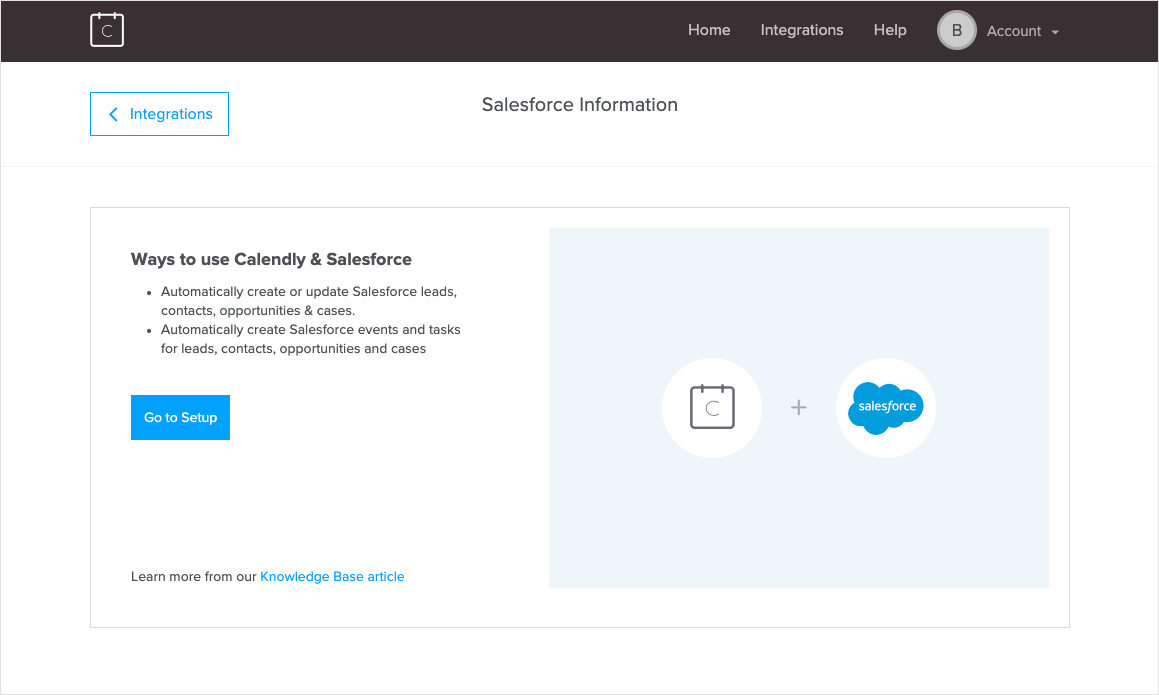
The original Salesforce disconnected page: minimal context about what the integration does, no subscription requirements listed, and no clarity on whether any user could connect it or only admins.
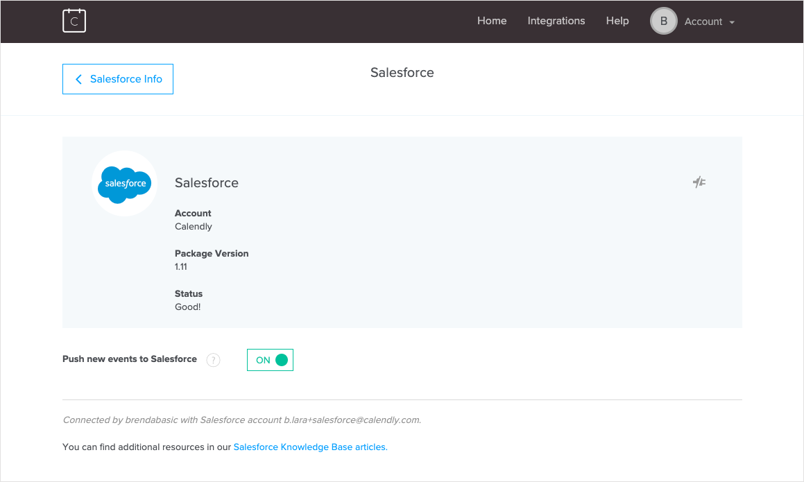
The original Salesforce connected page: vague status messaging, no indication of who connected the integration, and no room to scale as new configuration options were added.
"I am not sure what to do on this page because I don't see any instructions."
"After connecting the integration I expected the Salesforce card to look different, but maybe I didn't connect it right? I'm not sure that I did."
Getting to the truth
With the project greenlit, I went deeper. I researched 22 competitor and industry-leading integration pages, looking for patterns in visual hierarchy, categorization, connected vs. disconnected states, and how the best products handled the difference between native and third-party integrations.
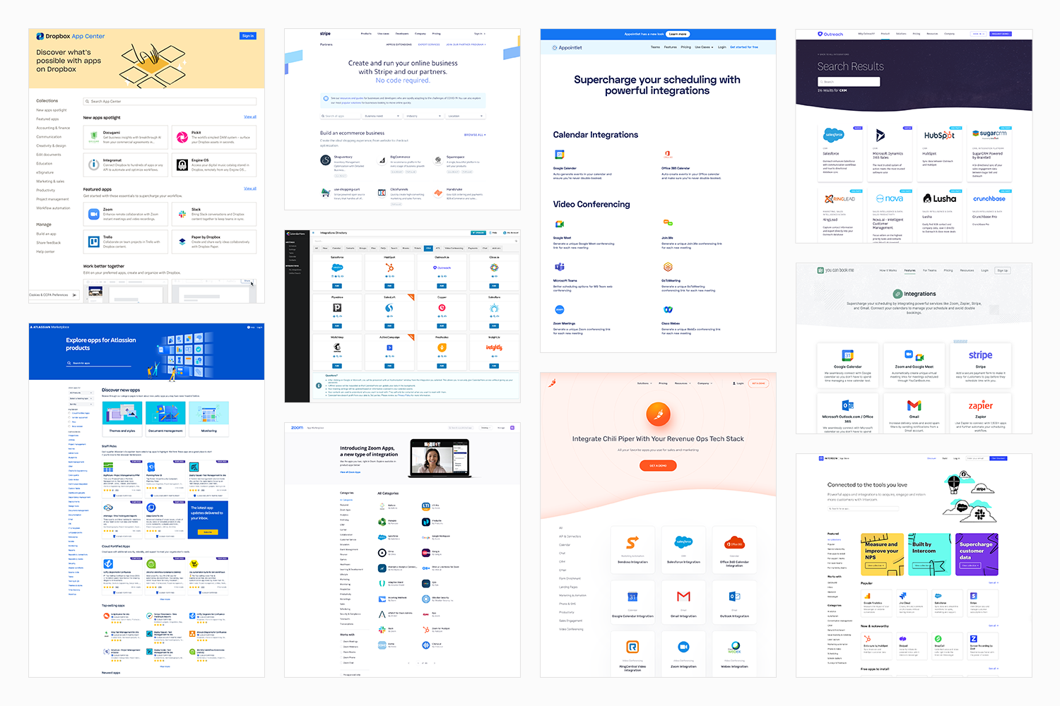
Competitive analysis of 22 integration pages, looking for patterns in visual hierarchy, categorization, connected states, and how industry leaders distinguish native from third-party integrations.
For the Salesforce redesign, I researched another 22 settings and profile pages from products like Slack, Zapier, Google, Greenhouse, and Salesforce itself, looking specifically at how others handle configuration-heavy experiences.
To define the new category structure, I ran card sorting sessions with 11 internal stakeholders and 3 rounds of sessions with 10 external Calendly users each. A key finding: users categorized integrations by the job they were trying to do, not by integration type. Some integrations ended up in multiple categories to reflect different use cases. I facilitated all sessions, analyzed the findings, and presented the new category framework to stakeholders.
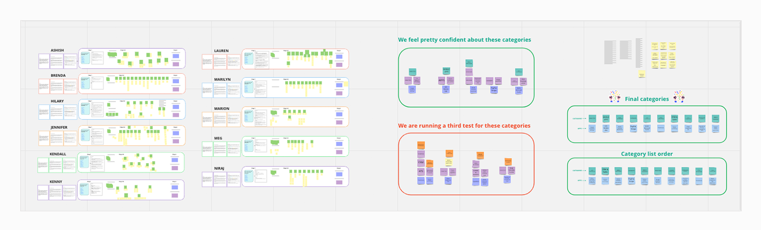
Internal card sorting sessions with 11 stakeholders, used to establish an initial category framework before validating with external users.
Three rounds of card sorting with 10 external Calendly users each, revealing that users categorize integrations by job to be done rather than by type, leading to some integrations appearing in multiple categories.
I also created personas and journey maps for Salesforce users and mapped the Zoom integration journey to understand the full range of our user types, from technical admins configuring complex enterprise integrations to everyday users connecting simple tools like Zoom.
What we built, and why
The redesign had two phases, sequenced deliberately.
Phase 1 focused on the integrations homepage. While the Routing team was building a new feature that would require Salesforce configuration, we used that window to redesign the homepage. By the time Routing launched, we knew exactly what the Salesforce page needed to support. Starting with the homepage also let us build the scalable framework first: new categories, updated card design, and the visual patterns that all 41 integrations would follow.
Early wireframes and design explorations for the integrations homepage, including three concepts that were validated with users before the final direction was chosen.
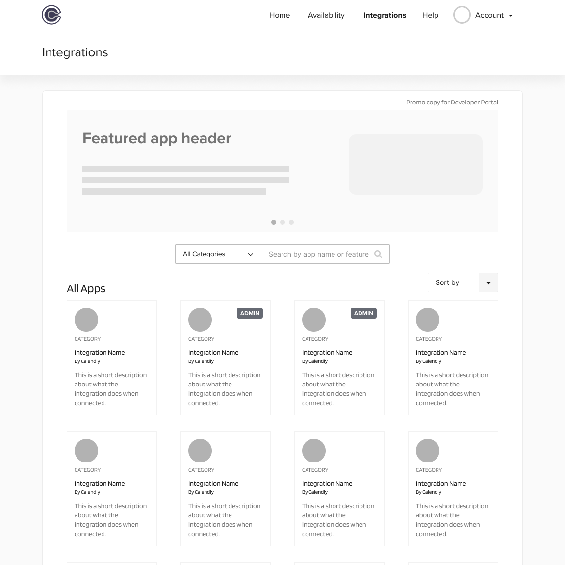
The homepage updates included a large hero section to promote featured integrations and new functionality, a new category structure based on jobs to be done, redesigned integration cards with cleaner logo treatment, admin-only badges for restricted integrations, a hover state for better interactivity feedback, and a connected state that made it immediately clear which integrations were active.
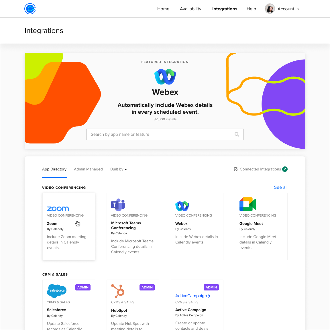
The redesigned integrations homepage: a large hero section for featured integrations, a new category structure based on jobs to be done, cleaner card design, and admin-only badges for restricted integrations.
Phase 2 focused on the Salesforce connected page, the most complex integration with approximately 35,000 monthly active users. Salesforce was the right place to start because if the design worked for the hardest case, simpler integrations would follow the same pattern naturally.
The Salesforce updates included refreshed confirmation and error banners, the name of the admin who connected the integration, a redesigned Disconnect CTA, collapsible sections to reduce visual clutter, a "How it works" paragraph with Help Center links, and new functionality including a Sync CTA and Advanced Routing configuration for a highly requested feature.
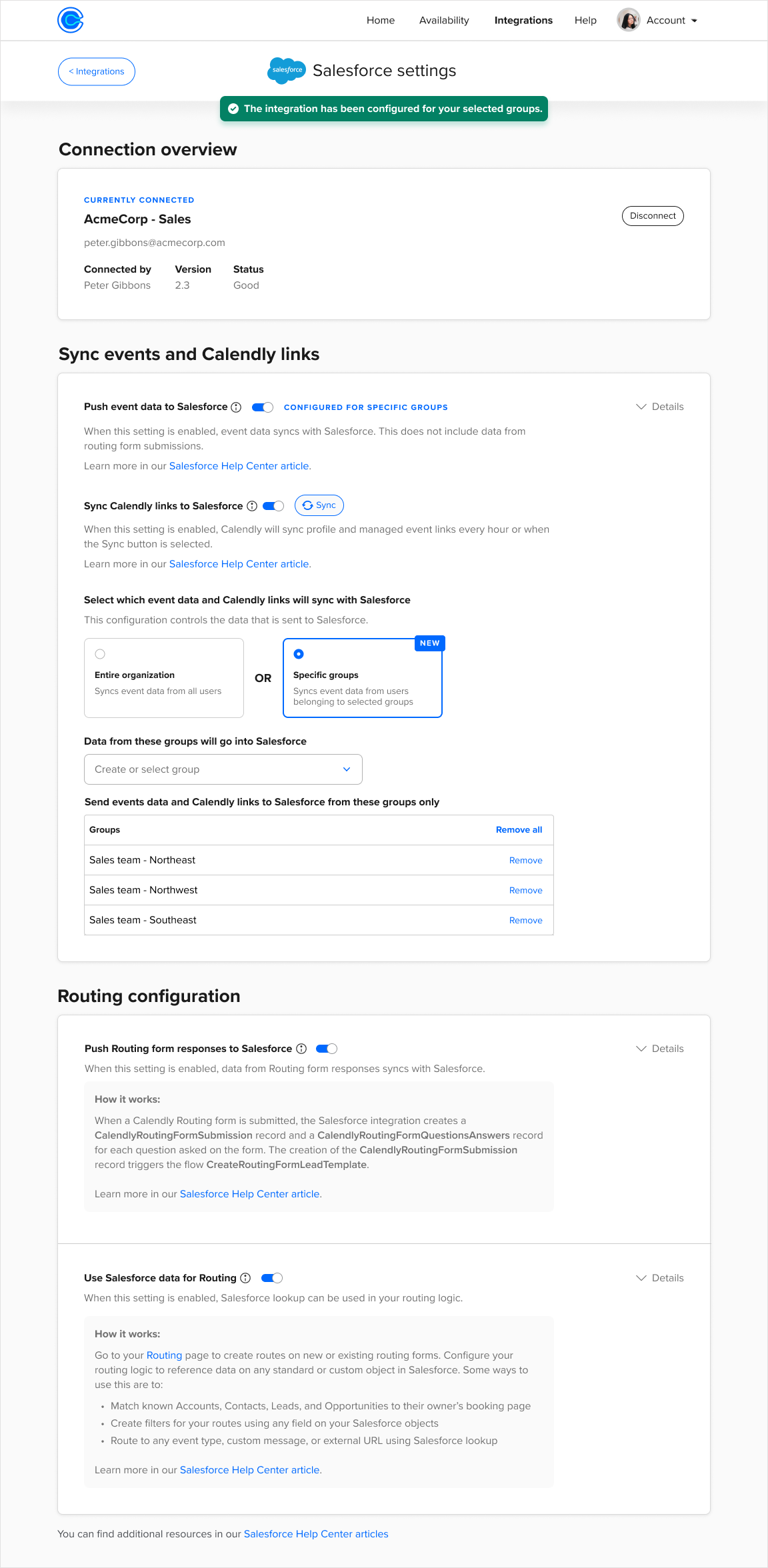
The redesigned Salesforce connected page: clear connection overview showing who configured the integration, collapsible sections to reduce visual clutter, "How it works" guidance throughout, and new Advanced Routing configuration that Calendly features depended on.
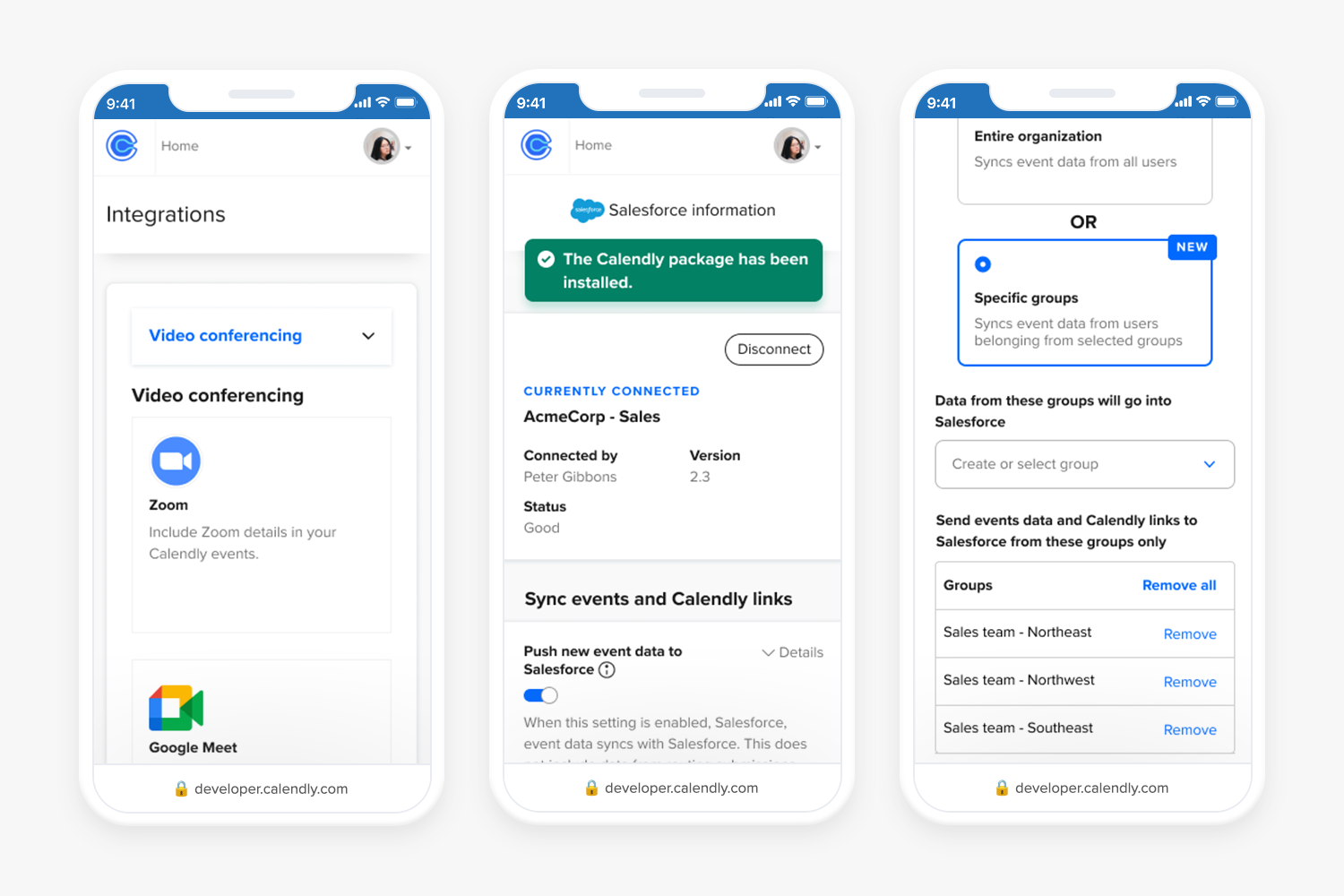
The redesign extended to mobile web, showing the category navigation, Salesforce connected state, and group configuration working consistently across device sizes.
All copy was reviewed and approved by CX, content strategy, engineering, QE, and content design before shipping.
What it took to ship it
This was a deeply cross-functional project. I partnered closely with my product manager, a content designer, engineers, and QE throughout. I shared in-progress concepts at weekly UX and product meetings, recorded Loom videos to collect async feedback across teams, and presented final concepts at the monthly portfolio review attended by the CEO and cross-functional leads.
During Phase 2, our product manager moved to another team. A new PM stepped in with limited availability, so I took on more of the day-to-day coordination and kept the project moving. I also led the Beta testing phase directly, reaching out to participants, walking them through the improvements, and gathering their feedback.
One detail that made the research harder: some of the competitor products I needed to analyze required admin accounts or paid subscriptions I didn't have access to. I adapted by finding recorded demos on YouTube and collaborating with coworkers who had access, so the competitive analysis stayed comprehensive.
I worked closely with the design systems team to contribute new components to the Figma library, making sure the patterns we established for integrations could scale across the product.
What changed
Both phases shipped in 2023. Thirty days after launch, the results showed the redesign had a meaningful impact across the board.
Challenges
Two challenges shaped how I approached this project and how I think about design leadership today.