Calendly Integrations Pages Redesign
My Role
Research, Wireframes, Flowcharts • UI/UX Design, Prototypes, Usability Test, Beta Test
Challenges + Opportunities + Learnings
Challenge #1: Addressing usability issues. Despite encountering numerous usability hurdles on Calendly's in-app Integrations homepage, adding this project to the roadmap posed a challenge due to the difficulty in quantifying usability issues.
Opportunities: Recognizing that ease of use is important, I explored various solutions to gain approval for tackling this issue. In this process, I came across the System Usability (SUS) Test, which provided a valuable baseline score for usability.
Learnings: By incorporating this research method, we obtained the necessary metric to justify and greenlight the project. My manager commended my resourcefulness in discovering the SUS test, and it became one of the methods adopted to evaluate usability across projects.
Challenge #2: Transitioning without a Product Manager. Another hurdle we encountered was when our product manager transitioned to another team during development. Fortunately, another manager stepped in to offer support.
Opportunities: With the Salesforce connection experience nearing its Beta Testing phase, I assumed leadership by engaging potential participants. I guided them through the enhancements and analyzed their feedback, ensuring the project stayed on track despite the managerial transition.
Learnings: This experience was a valuable learning curve, offering insights into project management, communication strategies, and stakeholder engagement. Navigating through unexpected challenges fostered resourcefulness and problem-solving skills, enhancing my capabilities as a leader.
CASE STUDY
What are Calendly integrations?
Integrations allow customers to use Calendly alongside other tools and services. By connecting an integration, their meeting information and scheduling data can sync directly with other tools in their tech stack to eliminate any additional work.
From a business standpoint, integrations hold significant value because automating customer processes enhances customer retention, making them more likely to remain loyal customers and less prone to churn.
Starting with The Problem
Calendly faced challenges with its in-app Integrations homepage, placing a considerable cognitive burden on users and lacking scalability. Users found it challenging to identify connected integrations, distinguish similarities in functionality or type, and differentiate configurations set by an administrator from those configured by a user. The limitations extended to the inability to effectively promote apps, extensions, or third-party integrations.
Who is the user?
Calendly's in-app integrations cater to a diverse user base, including professionals and businesses across various industries. These users leverage a wide array of integrations—from CRMs to analytics, marketing, and extensions—to streamline workflow processes and enhance productivity in their scheduling endeavors.

Research + Methodology
A few quotes taken from the research sessions:
“I am not sure what to do on this page because I don’t see any instructions. ”
“After connecting the integration I expected the Salesforce card to look different, but maybe I didn’t connect it right? I’m not sure that I did.”
I started the project by conducting two comprehensive forms of research:
Moderated UserTesting.com Sessions:
Twelve participants were involved in sessions utilizing a Figma prototype.
Task & Goal: The task assigned was to connect Salesforce to Calendly.
Objective: The primary aim was to observe participants as they navigated through the task, understand their thoughts and expectations, and pose numerous questions.
Results: Out of the 12 participants, nine successfully connected Salesforce. However, the majority encountered issues or faced confusion during the process.
SUS Test (System Usability Scale):
Thirty participants took part in sessions utilizing a Figma prototype.
Task: Similar to the Moderated UserTesting.com Sessions, participants were tasked with connecting Salesforce to Calendly.
Objective: The goal was to establish a baseline usability score.
Results: The score was 49, with 68 being considered an average score in this context.
Researching solutions
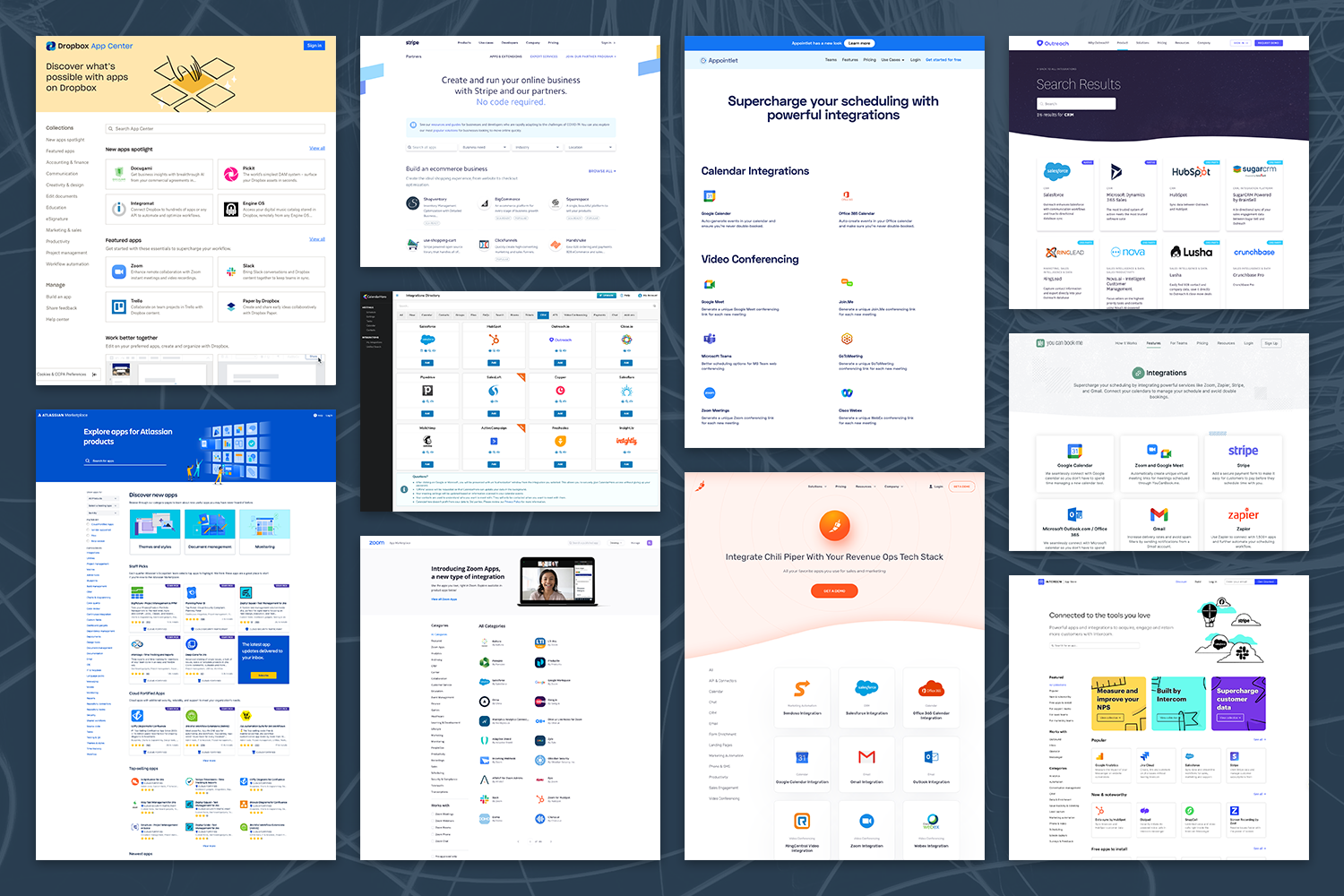
I reviewed competitors and industry leaders to analyze how they present their integration pages. The goal of my research was to establish and implement UI design best practices that are in line with modern aesthetics and current industry trends. This strategic method guaranteed that our integration interface would be competitive, visually engaging, and user-friendly.

Testing solutions
To develop a scalable framework, we began by identifying categories. Our team brainstormed an initial list, which I then utilized in my card sorting sessions. Through these sessions, I noticed that participants categorized certain integrations based on the specific tasks they used them for, especially those with multiple features. This led us to the decision that some integrations would belong to more than one category.

From wireframes to designs
Design, collaborate, gather feedback, iterate and repeat…
I wireframed three concepts and designed several rounds of high fidelity mockups. This process was a result of close collaboration with key stakeholders. UserTesting.com research sessions were conducted to validate the final designs. I also worked with the design systems team to add any new components to our Figma library.


The new Integrations homepage
The new homepage improves user engagement and navigation. The updates include:
A top large hero section that showcase up to three integrations and highlight new functionality.
New categories to enhance the organization and clarity of the page.
Redesigned integration cards with a simplified logo treatment, updated description, new admin badges for those integrations that can only be configured by an admin, and a hover state that enhances interactivity and user feedback.
These updates contribute to a more intuitive and user-friendly browsing experience for customers.


The new Salesforce connected page
Following the successful redesign of our homepage, our team shifted focus to revamping our integrations connected template. With Salesforce emerging as our largest integration, boasting over 35,000 Monthly Active Users (MAU), we prioritized its enhancement due to its complexity and pivotal role in powering several new Calendly features. Focusing on our largest integration upfront gave us confidence that our simpler integrations would easily follow this pattern.
The new connected page enhance user experience and functionality. The updates include:
Confirmation banners with detailed descriptions.
The name of the admin who connected the integration.
New disconnect button.
Collapsible sections that allow users to manage their configurations more efficiently.
A "How it works" paragraph with with links to the Help Center for further information ensure that users have access to comprehensive guidance.
We also introduced configuration for Advanced Routing, a highly requested feature. All final designs were result of team collaboration, comprehensive validation processes, and many design reviews to ensure the final designs met user needs and expectations.


Some metrics
30 days post the integration page redesign release
Our 1st party integration MAU grew by 27.3% compared to the previous month
The Salesforce Promo banner helped drive 22.6% of all Salesforce connections
Salesforce MAU grew by 42.9% compared to the previous year
Conversion rate of customers landing on the Integration page and clicking a tile improved by 10 percentage points, reaching about 61%