Calendly Developer Portal
The launched Calendly Developer Portal, a centralized hub for API documentation, use cases, tutorials, and developer resources.
The setup
Calendly had a problem hiding in plain sight. Developers and technology partners who wanted to build on top of Calendly's API had nowhere to go. Documentation lived in Stoplight, a third-party tool that got the job done but wasn't Calendly's. There was no branded home, no centralized resource, no experience designed for the people building on the platform.
The CEO championed the need for a real developer portal and the project was greenlit. I owned the design end to end, supporting both the Integrations and API squads at Calendly, and this project sat squarely at the intersection of both.
What was broken
Before I opened Figma, two constraints made this project harder than it looked on paper.
The engineering team assigned to the project was backend-heavy. Frontend work was unfamiliar territory, and in early meetings I could sense the tension. Low morale in a room is easy to miss and hard to recover from. I didn't ignore it.
At the same time, Calendly was in the middle of a full rebrand led by an external agency. I didn't know what the final brand would look like or when it would land. That meant I couldn't design one portal. I had to design three versions and produce two complete style guides to cover both the interim and incoming brand.
The engineers assigned to the project weren't comfortable with frontend work. I could feel the tension in our meetings. So instead of waiting for someone else to solve it, I went looking for a solution myself.
Brenda Lara, on reading the roomGetting close to the problem
I started with competitive research by reviewing how industry leaders structured their developer portals to identify UI best practices and set a quality bar. The goal wasn't to copy. It was to understand what developers actually expect when they show up to a portal, and design to meet that bar.
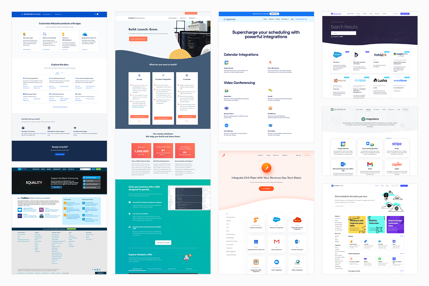
Competitive research reviewing how industry leaders structure their developer portals, used to establish UI best practices and set a quality bar for the design.
On the team side, I went looking for a solution to the frontend gap. I reached out across several teams at Calendly to get advice, and found a group of full-stack engineers with available bandwidth. I brought the idea to my manager and PM, proposed the collaboration, and set up the initial meeting to get everyone aligned. That cross-functional team became the engine that got the portal built. The wording and content throughout the portal was also a collaboration with the engineering team; they're developers, they know the language their users speak.
What I built, and why
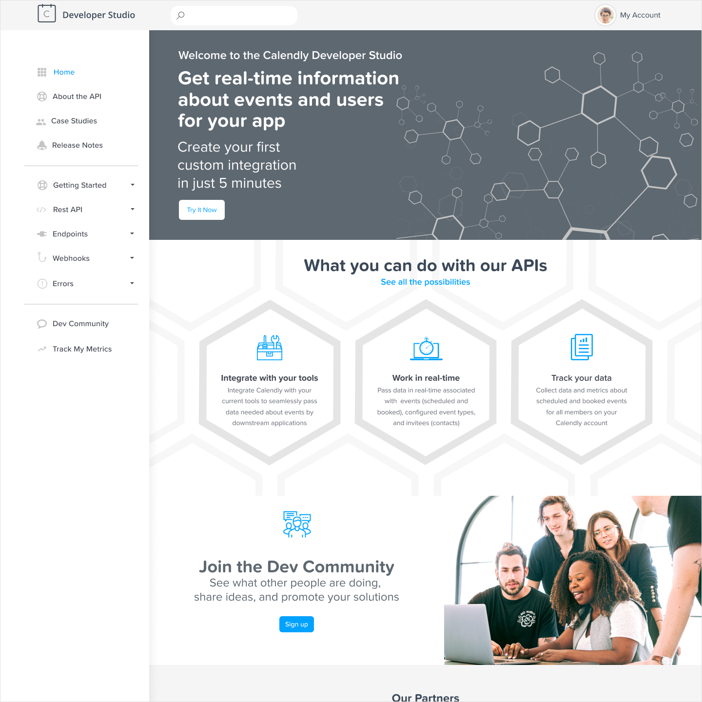
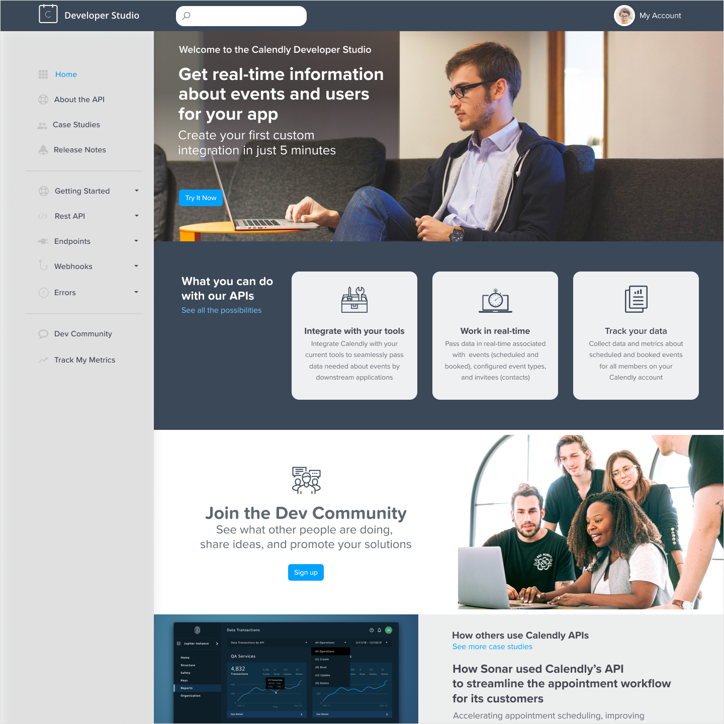
Phase One was the portal itself: a centralized hub with up-to-date API documentation, release notes, use cases, tutorials, sample code, and support information. I wireframed different concepts and ran multiple rounds of high-fidelity mockups in close collaboration with stakeholders. I created the prototype and test plan for UserTesting.com research sessions, with my PM stepping in to run the sessions themselves. New components went into the Figma library in coordination with the design systems team.
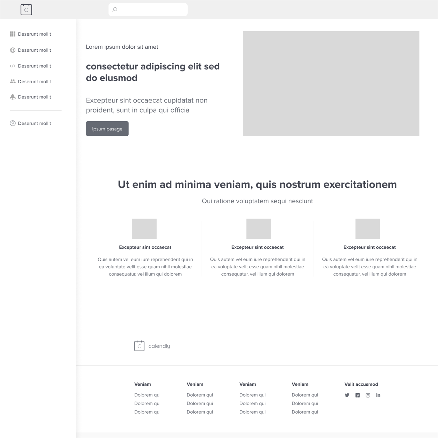
Early wireframes exploring the guided setup flow and post-configuration management view, used to align stakeholders before moving to high-fidelity designs.
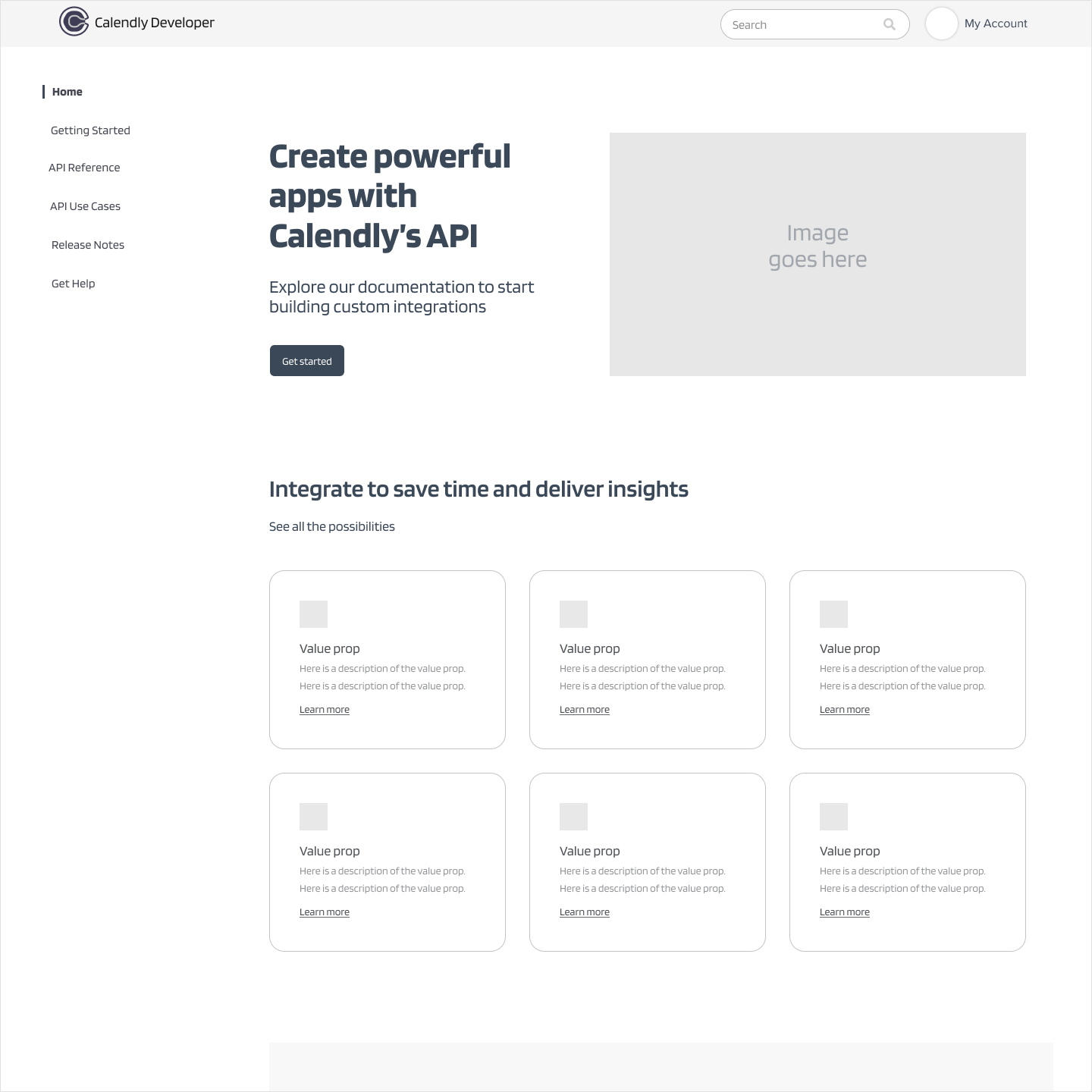
Design concepts explored during the high-fidelity phase, refined through close collaboration with stakeholders before landing on the final direction.
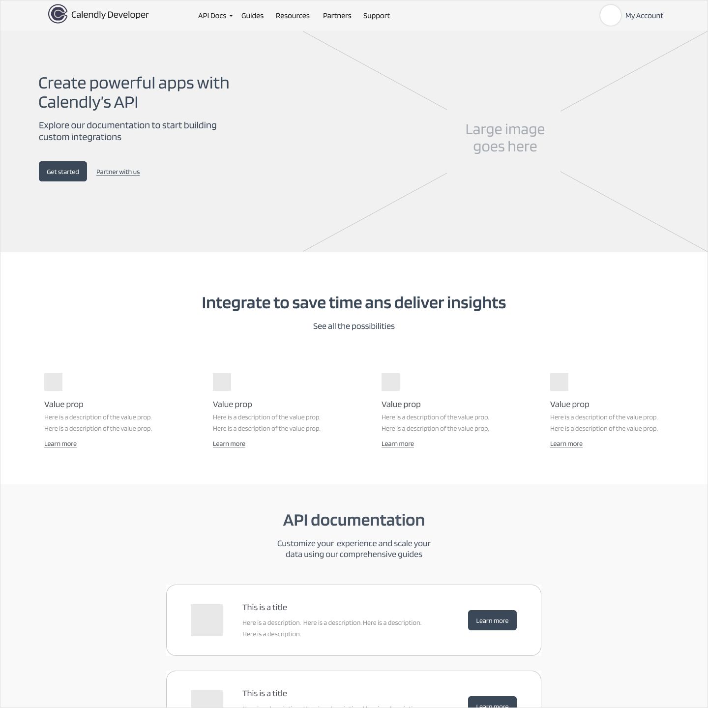
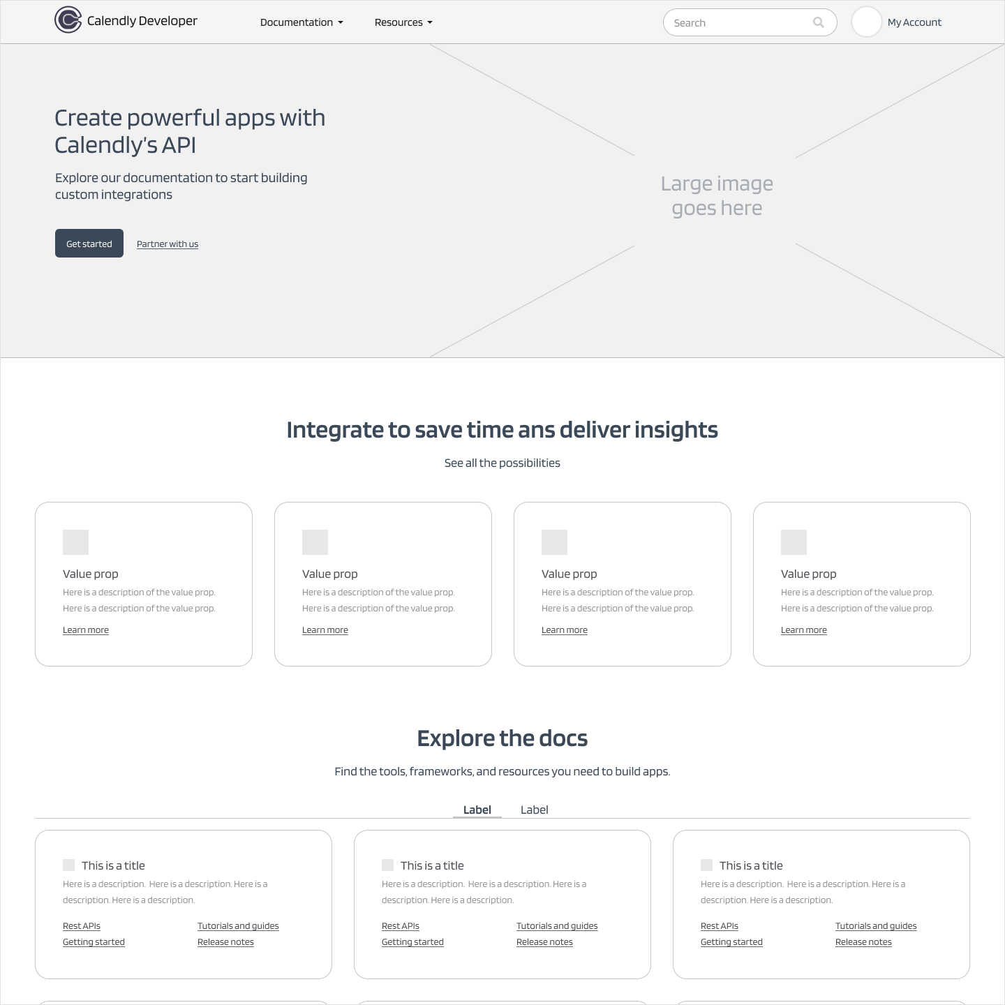
The portal launched first under the interim brand, then transitioned through Calendly's rebrand; both of which I had designed for in advance.
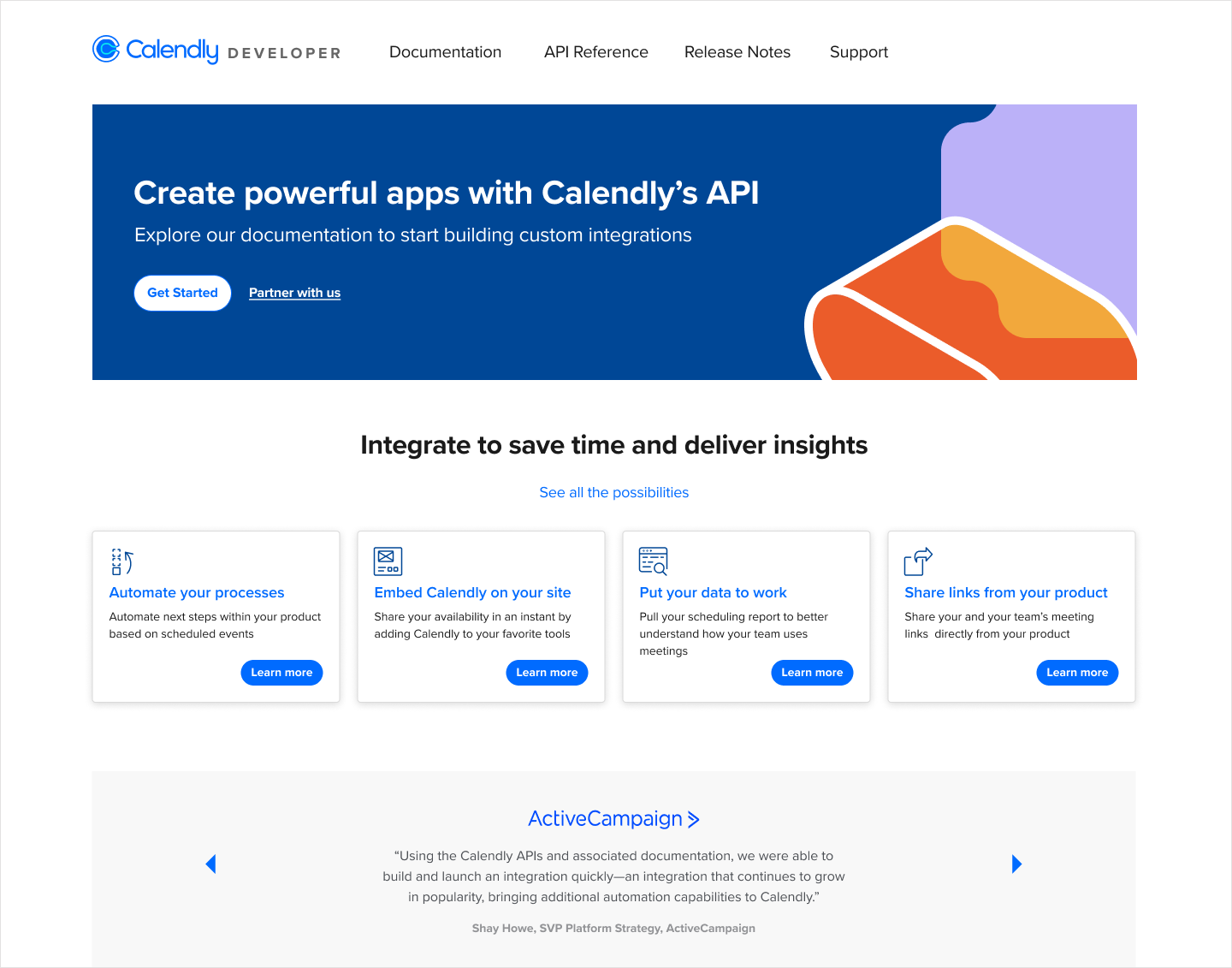
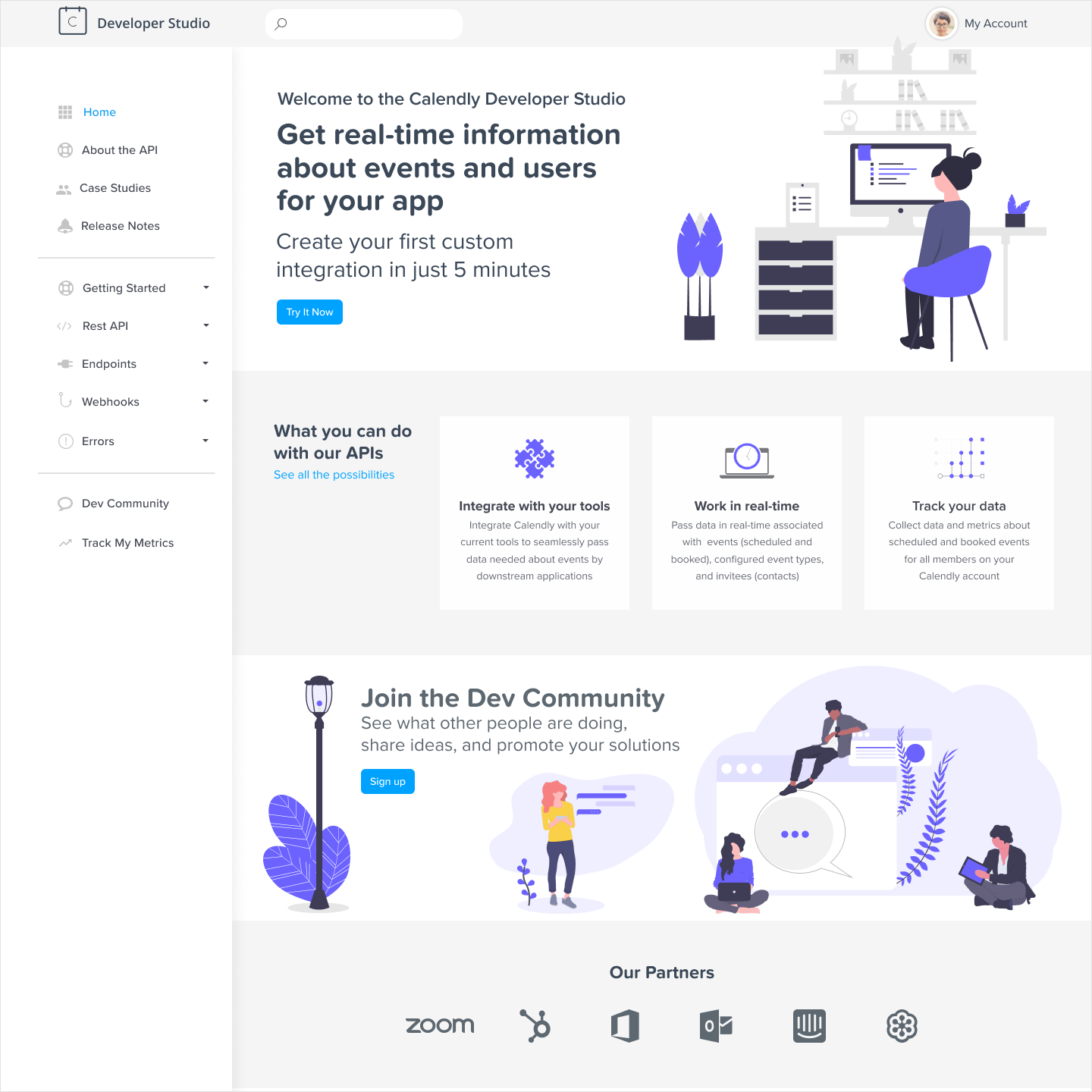
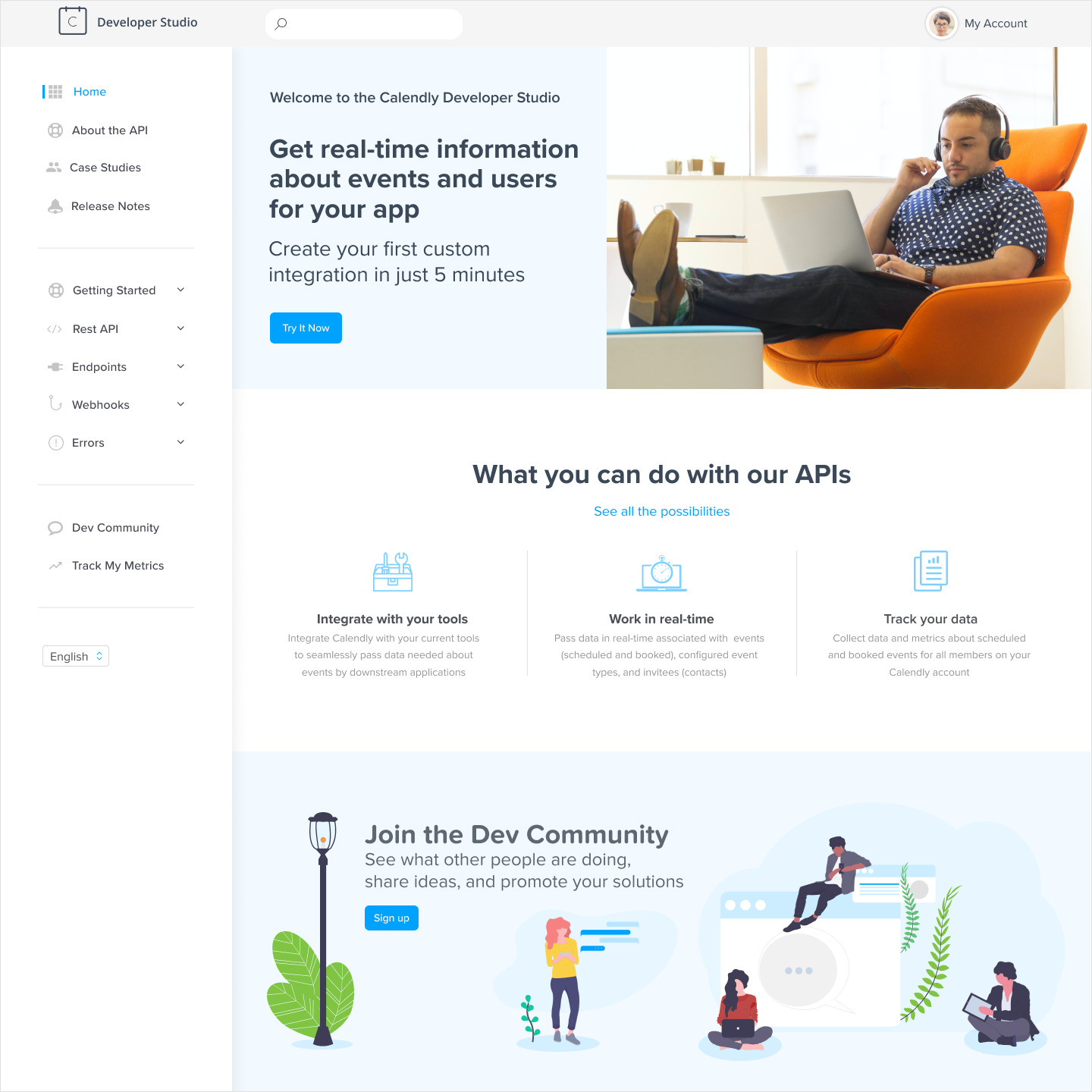
The Developer Portal at interim launch, designed against Calendly's existing brand while the rebrand was still in progress.
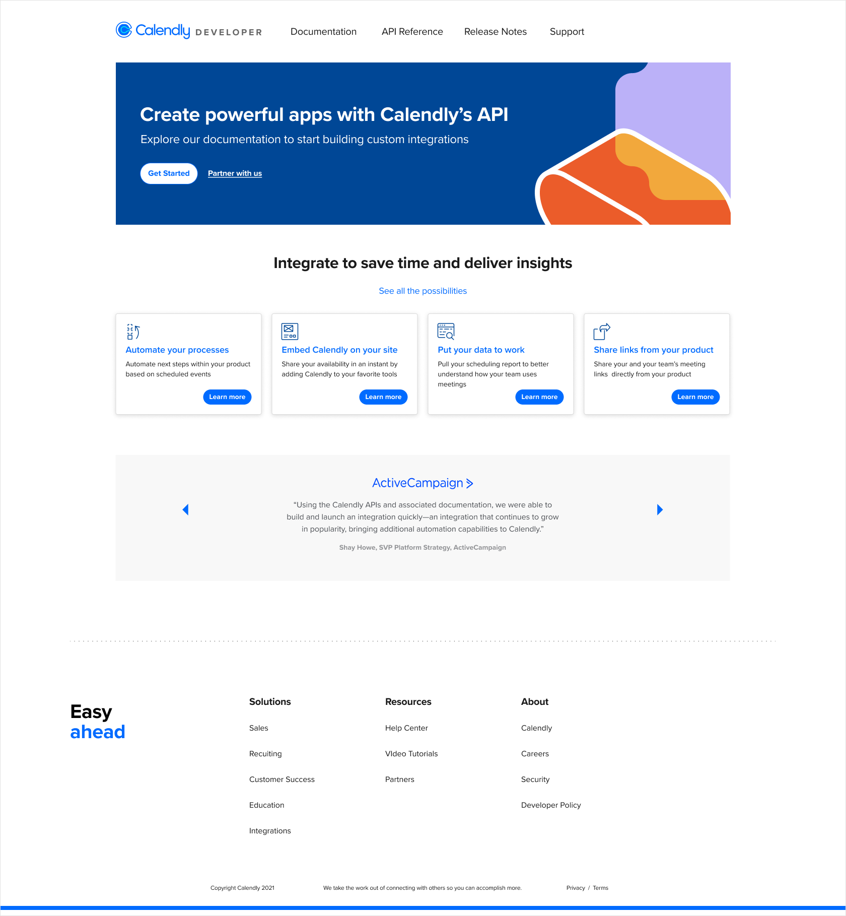
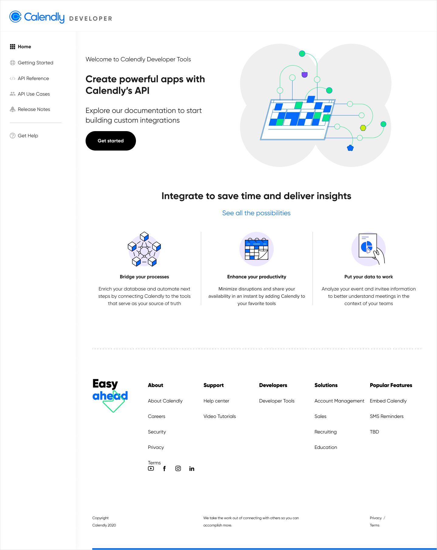
The final Developer Portal post-rebrand, the version that went live after Calendly's new visual identity landed.
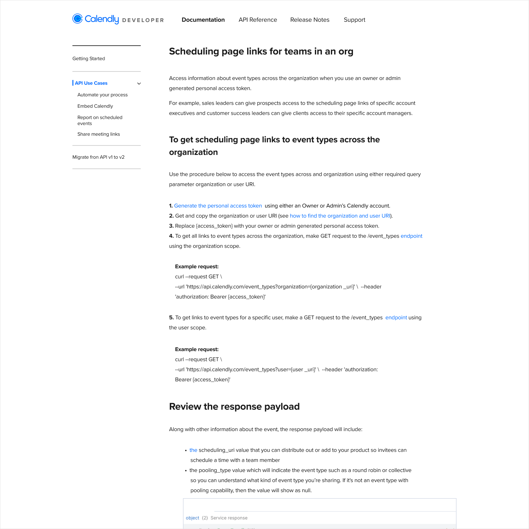
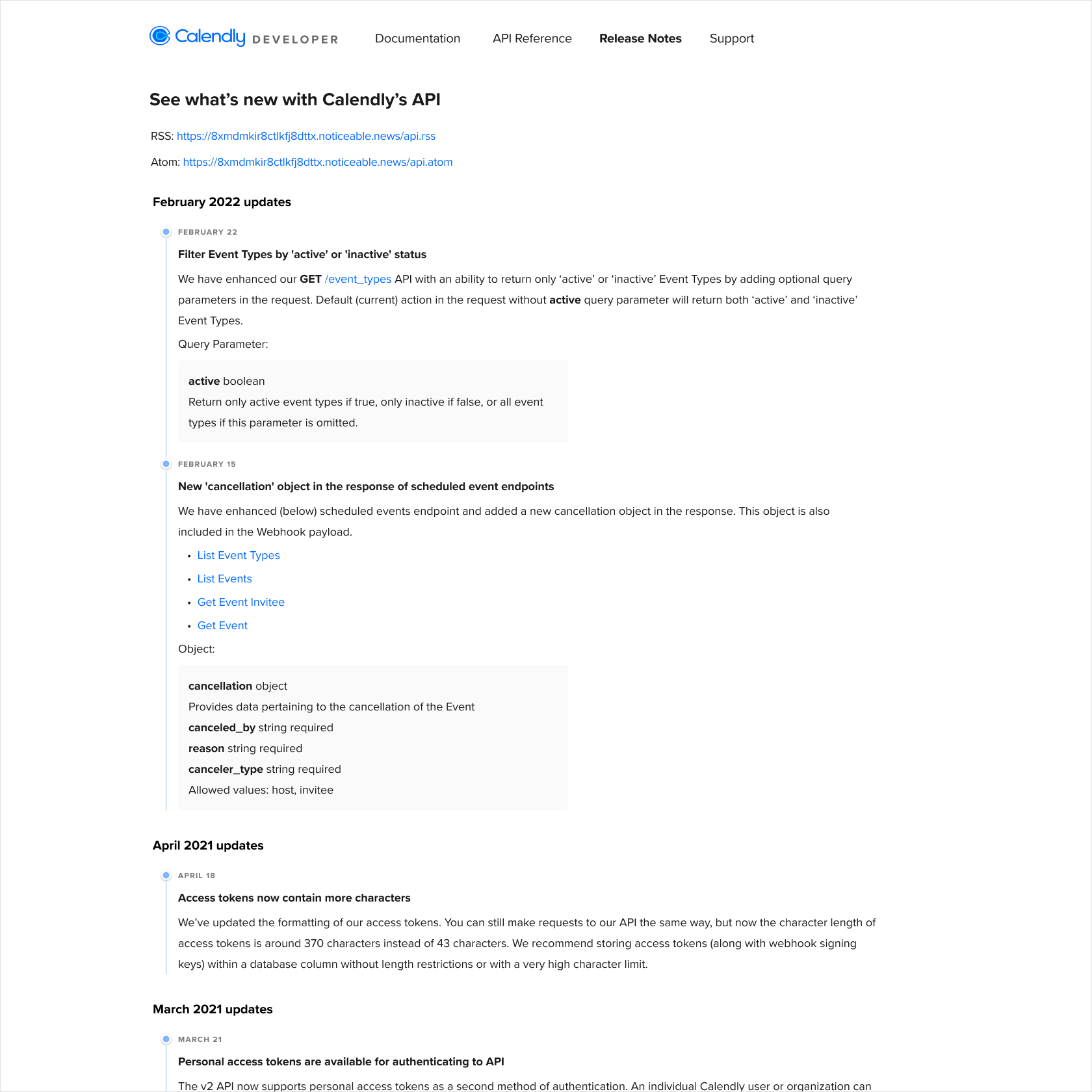
Interior pages of the launched Developer Portal: API Use Cases documentation on the left, Release Notes on the right.
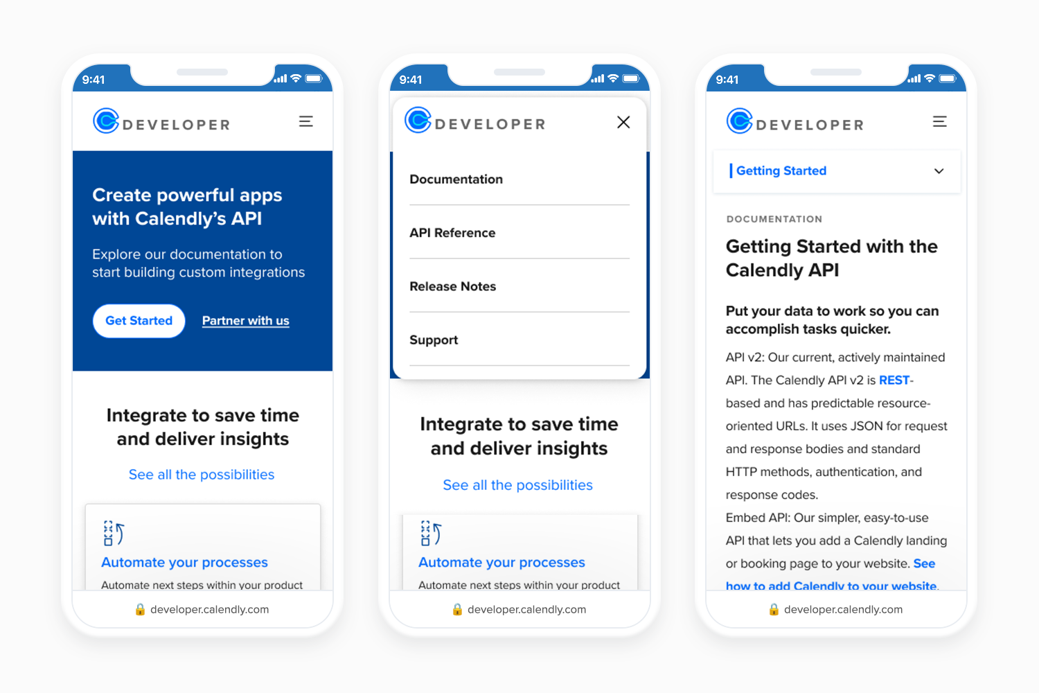
Mobile experience of the launched Developer Portal: homepage, navigation, and documentation view, designed to be fully responsive across all screen sizes.
Phase Two had been on the roadmap from the start. We knew the OAuth onboarding process needed fixing; developers filled out a survey, received credentials through LastPass, and if anything broke in that handoff, support stepped in to clean it up. It was slow, insecure, and entirely manual. We sequenced it second because team bandwidth didn't allow us to tackle both phases at once. When the portal was stable, we built self-serve app management directly into it; letting developers create, update, and delete their third-party applications without ever contacting support.
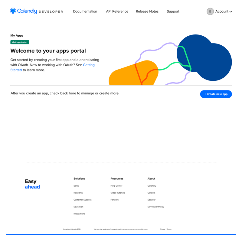
The self-serve OAuth app management flow, allowing developers to create, update, and delete their third-party applications without contacting support.
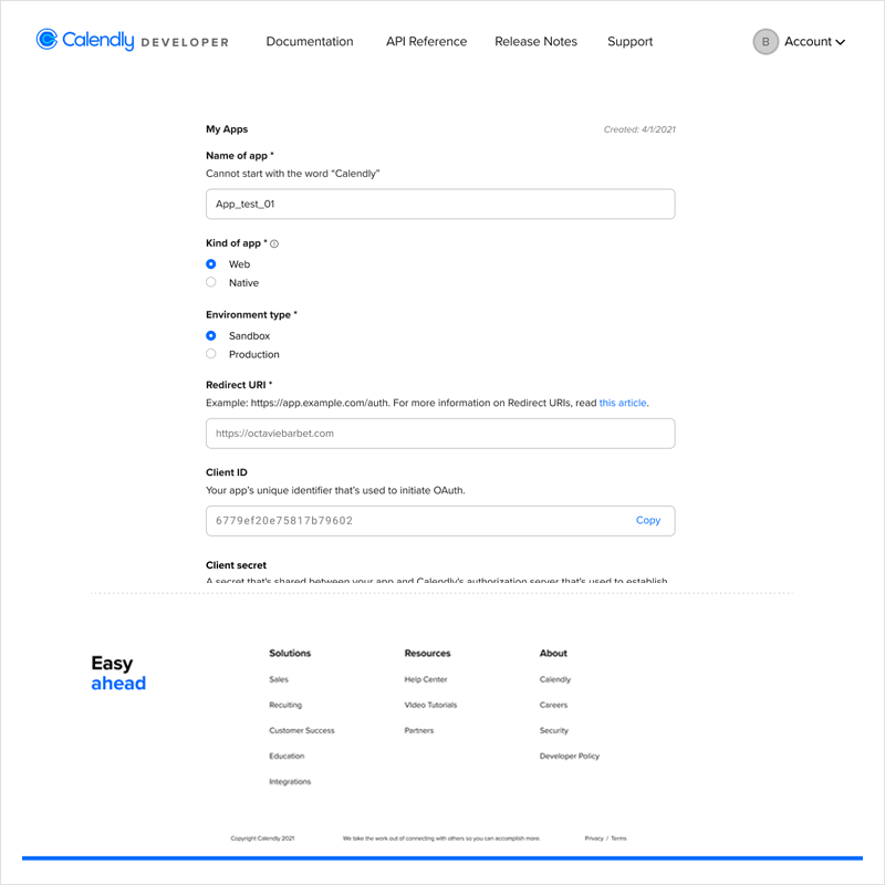
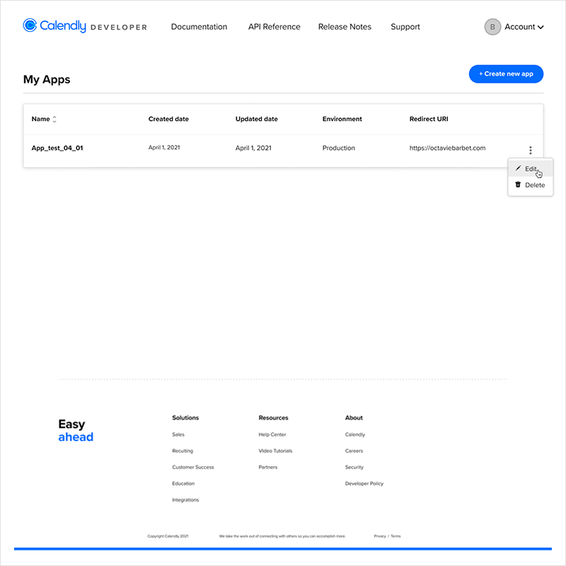
Phase Two desktop designs: app creation form on the left, app management dashboard on the right, giving developers full control over their OAuth applications.
What it took to ship it
Eight weeks, one designer, three design versions, two style guides, and a cross-functional team I helped assemble. I presented at key milestones to the CEO and worked closely with product throughout. The real work wasn't just the design; it was keeping a team moving through ambiguity while a rebrand was happening in parallel and the engineering team was learning new territory.
What changed
Both phases shipped in 2023. The results showed steady growth from launch through Calendly's rebrand and a significant jump in developer activity after Phase Two.
Challenges
Two challenges shaped how I worked on this project and how I think about design leadership today.